
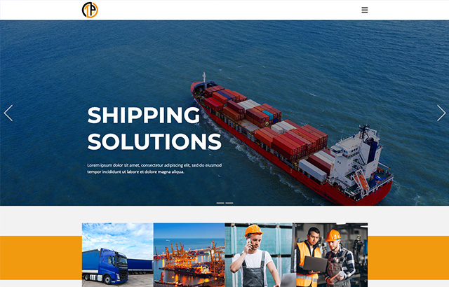
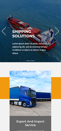
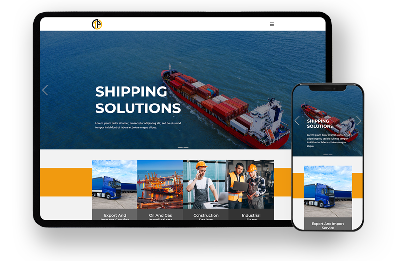
Designing a user-friendly experience and interface for TEPSA Transit Holdings was a challenging task due to the broad spectrum of activities within the company. With operations spanning gas, petrochemicals, transportation, and construction, striking the right balance posed a significant challenge.
To tackle the complex nature of TEPSA Transit Holdings, I initiated a comprehensive needs assessment. Given the diverse range of activities, this task required extensive guidance and multiple meetings with the top marketing managers. Ultimately, I successfully completed the needs assessment, focusing on delivering an appealing design and high-quality visuals for the company.
Beginning with wireframing, my primary focus was on mapping out user flows and obtaining feedback from customers regarding the initial drafts. With the aid of customer personas and data analysis, I refined the user flow, ensuring a seamless experience.
A crucial requirement was to provide users with easy access to the company’s various systems from the main page. Additionally, I designed dedicated landing pages for each service, aligning with their specific goals through discussions with the sub-companies within the holding.
For the user experience and design, I adopted a color scheme featuring a mix of black and yellow, complemented by a neutral white color. Upon entering the main page, users are greeted with a compelling composite image showcasing our core activities in transportation and the oil and gas industry, effectively conveying our company’s essence.
In the next phase, I presented the holding’s services in a prioritized and visually clear manner. This allows users to effortlessly navigate to their desired landing pages, ensuring a smooth and intuitive browsing experience.




Elevate your project with my Top Rated expertise on Upwork. Experience seamless collaboration and quality results.