TPSA is a diverse commercial conglomerate offering a wide array of services, ranging from transportation and transit to involvement in the gas and oil industry. Among its many services is international transportation. TPSA stands out as one of the largest commercial transportation companies, boasting an extensive network of branches across 10 countries and facilitating the transit of goods to over 30 nations. With a rich history spanning more than three decades and a team of experienced professionals, including senior managers and dedicated workers, the company takes pride in its 300 loyal and satisfied customers.
Challenges
The primary challenge faced by TPSA was the diverse nature of its business operations. With activities spanning gas and petrochemical operations, transportation, and construction, the company needed a design solution that could accommodate this complexity while ensuring a seamless user experience.
Solutions/Results
To tackle these challenges, a comprehensive needs assessment was conducted. Given the wide scope of TPSA’s activities, this task was no small feat. Collaboration with the company’s top marketing managers was crucial in successfully completing the needs assessment.
1. User-Centric Approach:
The initial step involved prioritizing the user flow to gather feedback from customers. By incorporating customer personas and data, the user flow was refined. The goal was to seamlessly redirect users to other systems within the company from the main page, ensuring a smooth transition between services.
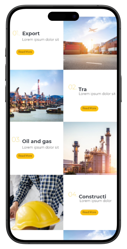
2. Dedicated Landing Pages:
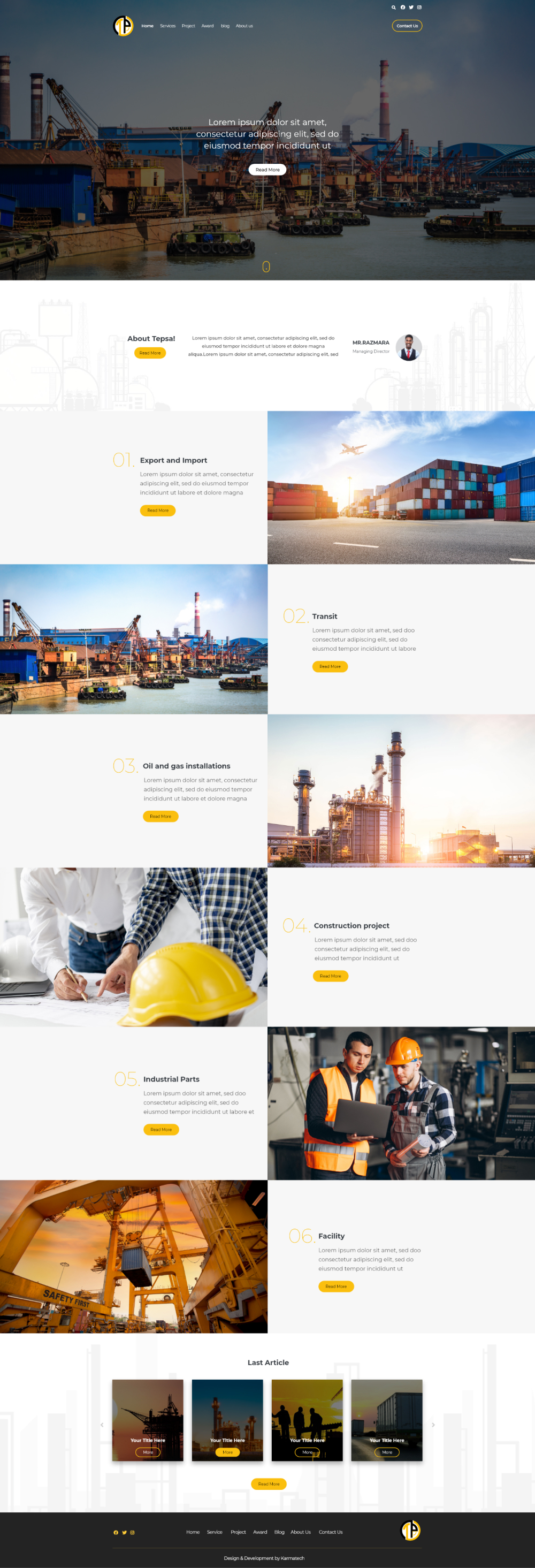
To address the multifaceted nature of TPSA’s business, dedicated landing pages were created for each service. These landing pages were designed with specific goals in mind and required close coordination with the holding’s subsidiary companies. This approach allowed for a tailored user experience, catering to the unique needs of each service.
3. Aesthetic Design:
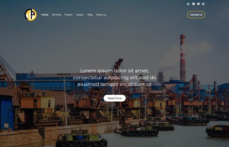
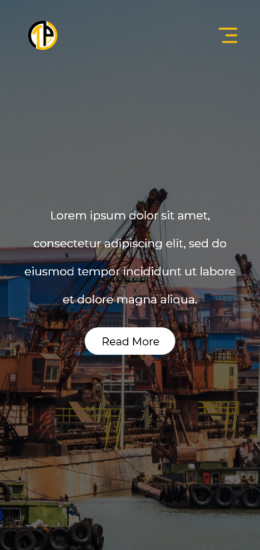
The final design incorporated a harmonious blend of black and yellow, along with a neutral white color scheme. The main page featured a composite image that effectively conveyed the core activities of the company, highlighting transportation and the oil and gas industry. Subsequent steps presented the holding’s services in a prioritized and clear manner, making it easy for users to navigate to their desired landing pages.
Conclusion:
Through a user-centric approach, dedicated landing pages, and an aesthetically pleasing design, TPSA successfully overcame the challenge of accommodating its multifaceted business operations. This transformation not only improved the user experience but also reinforced TPSA’s position as a leading commercial conglomerate, delighting its loyal customer base and facilitating growth in its diverse range of services.