
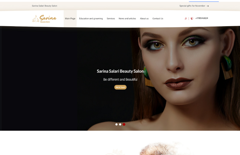
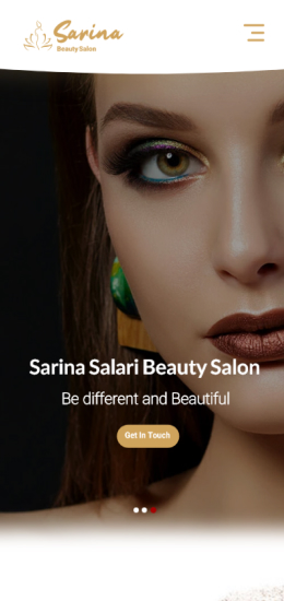
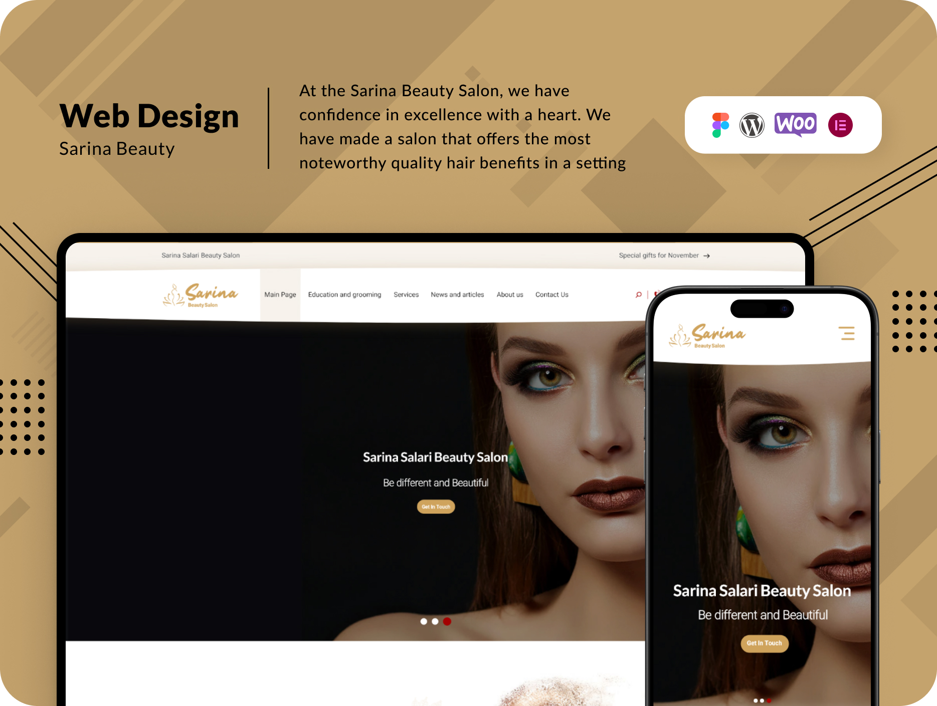
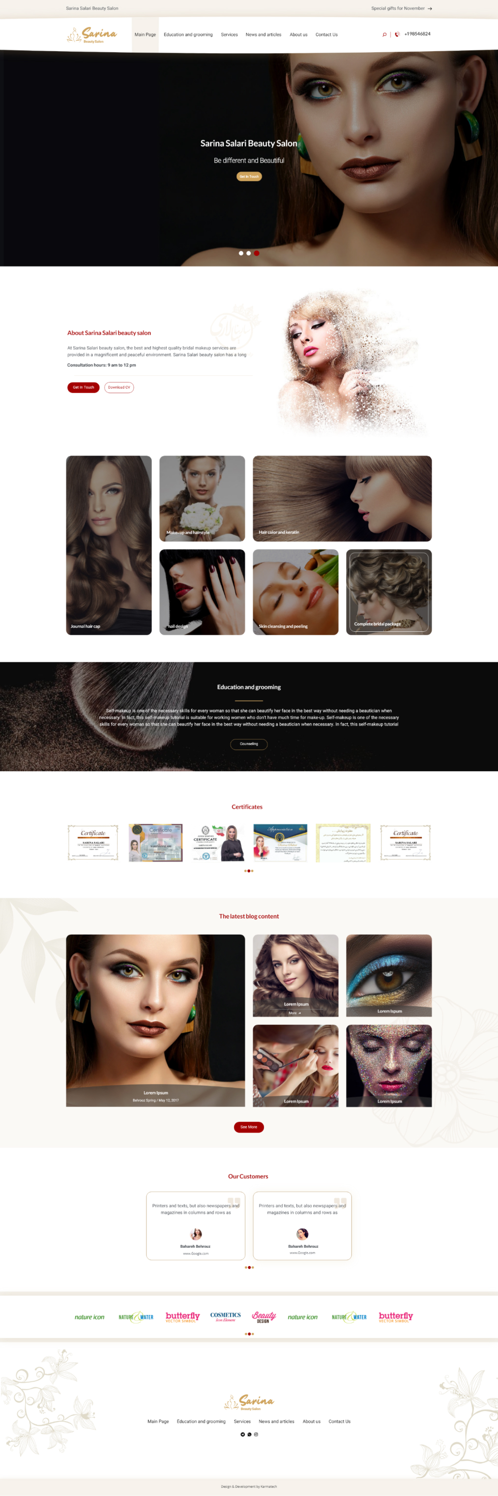
Sarina Beauty Salon embarked on its journey with the need to showcase their exceptional services online and, following their grand opening, establish a seamless reservation system for appointments. The primary goal was to encapsulate beauty, allure, and intimacy through their website.
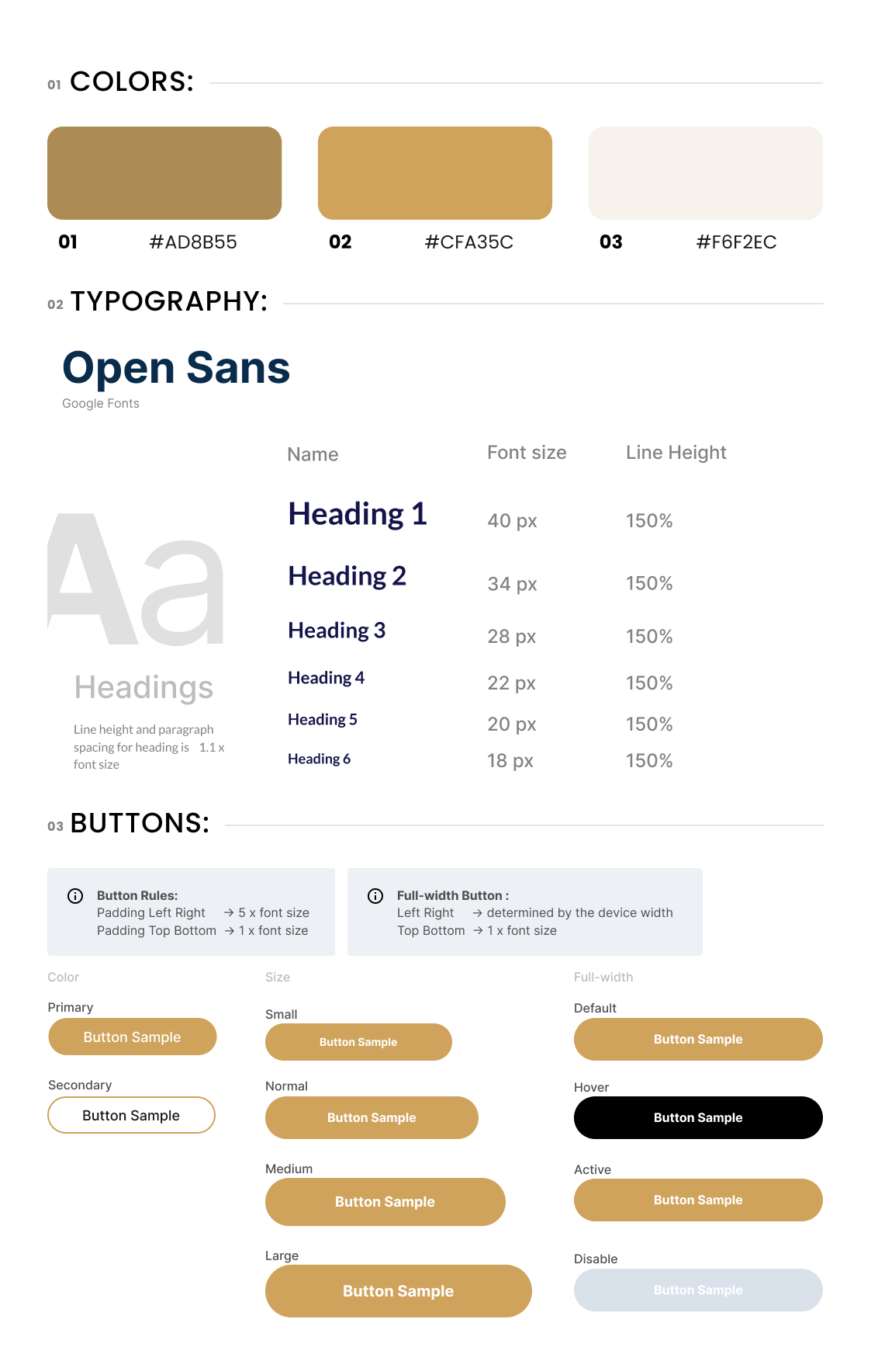
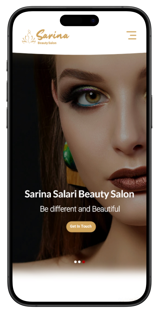
Crafting a Brand Identity: Sarina Beauty Salon lacked a distinct brand identity, which was the initial challenge. To harmonize my website with the existing physical designs, I set out to create a brand identity from the ground up. My task was to make subtle yet purposeful alterations to the existing designs while ensuring they resonated with the website’s objectives. This led to the birth of a compelling brand identity.
Results:
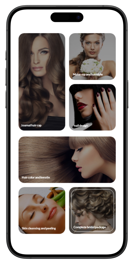
The transformation of Sarina Beauty Salon’s online presence was a resounding success. The new website elegantly encapsulated the essence of beauty, allure, and intimacy. I now had a strong brand identity that resonated with both my physical space and my digital realm. The website’s design, coupled with the anticipation of appointment reservations, ensured a seamless transition into this feature. The introduction of the “special gifts” section added a layer of exclusivity and engagement, further strengthening my bond with customers. Trust was built through authentic testimonials and visible certifications, cementing my reputation as a top-tier beauty salon.
This case study serves as a testament to the power of thoughtful design and strategy in transforming an online presence and fostering meaningful connections with clients. Sarina Beauty Salon, embodied by I, continues to thrive as a beauty sanctuary that not only pampers but also cares for the planet, its guests, and its dedicated team.


Elevate your project with my Top Rated expertise on Upwork. Experience seamless collaboration and quality results.