
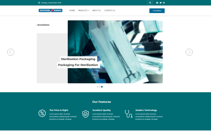
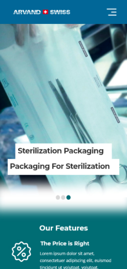
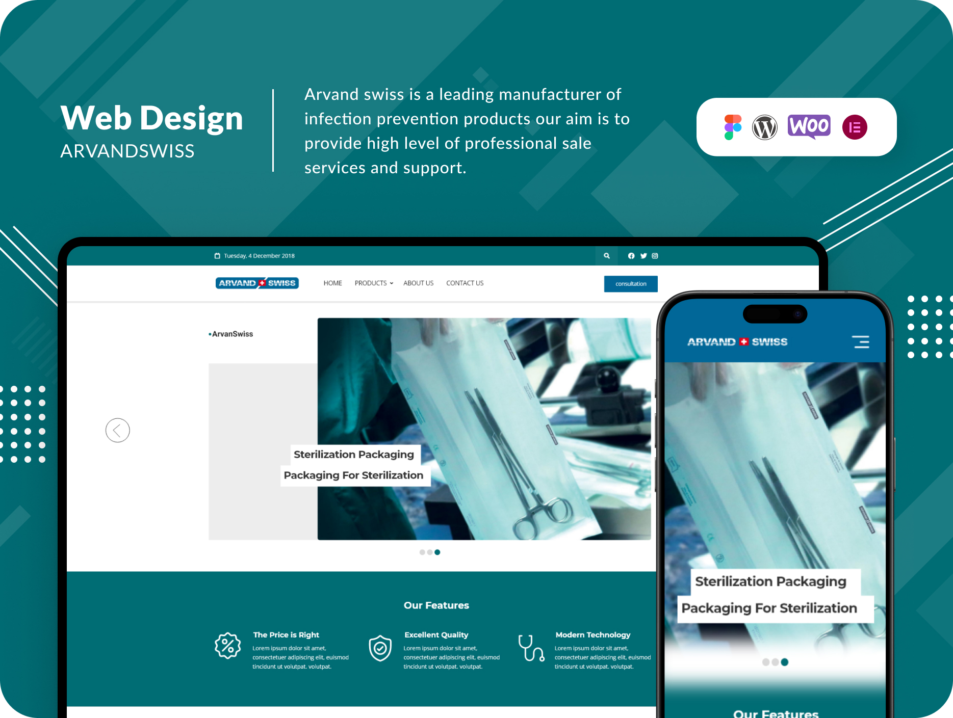
The central challenge Arvand Swiss faced during the development of their website was to prioritize simplicity and minimalistic design. Understanding the unique preferences of their European clientele, Arvand needed a website that conveyed a sense of health and well-being, while also providing a user-friendly experience.
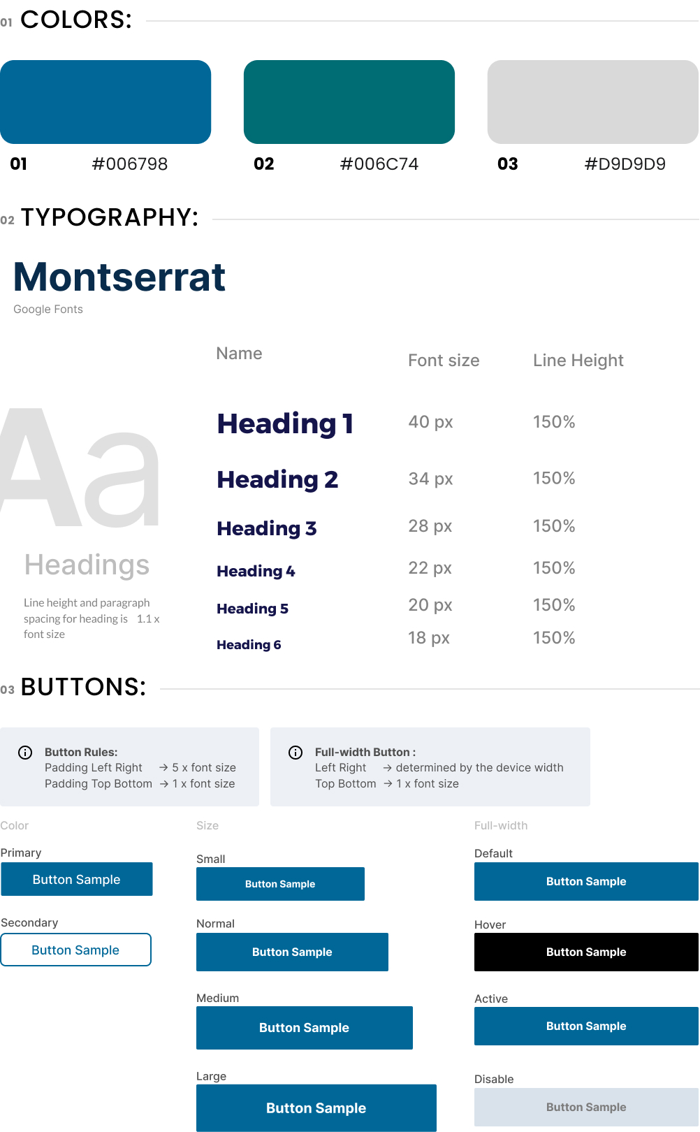
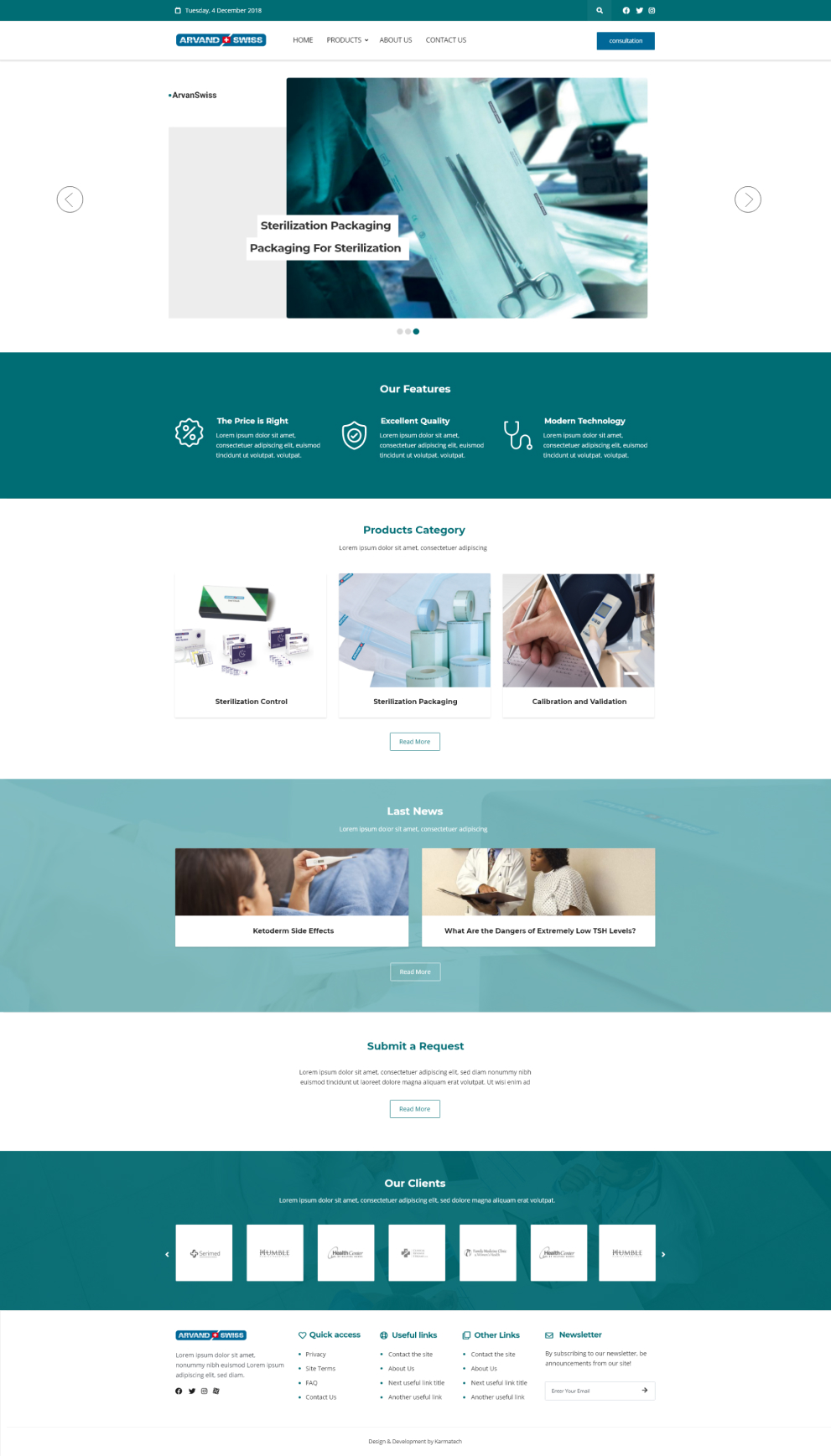
To achieve this, Arvand Swiss recognized that simplicity could vary in meaning from one region to another. In Europe, it often translated into the use of simple fonts and harmonious colors. Arvand Swiss, conscious of the need to convey a sense of health and well-being, chose a color palette dominated by soothing green and calming blue. These colors were carefully selected based on color psychology, associating green and blue with tranquility and health. The deliberate avoidance of gradient colors contributed to maintaining a minimalistic design that resonated with the preferences of European users.
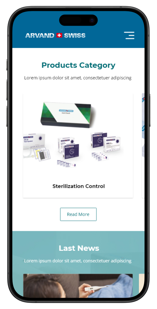
In addition to color choices, Arvand Swiss ensured that the user flow was designed for easy and clear access to services and products. Quick access to products and clear product details were deemed paramount. The product offerings were organized into collections in the middle section of the site, simplifying the process for customers to find their desired items. Arvand Swiss went a step further by conducting user experience tests on internal pages, continuously optimizing the user journey. Features such as implementing Ajax search in the product list and providing clear navigation with breadcrumbs were introduced to enhance the speed and ease of site navigation.
The Results: Arvand Swiss successfully transformed its online presence, aligning with the simplicity and user-centricity that European customers demanded. The newly designed website not only conveyed a sense of health and well-being but also delivered a seamless user experience. This transformation catapulted Arvand Swiss into a league of its own, setting new standards for infection prevention product manufacturers.
With a renewed commitment to customer satisfaction and a website that exemplifies simplicity and user-friendliness, Arvand Swiss is poised to thrive in an ever-evolving healthcare industry. Their journey towards excellence is marked by a deep understanding of regional aesthetics and a relentless pursuit of the best user experience. Arvand Swiss has truly embraced the principles of customer-centricity, making them a shining example in their industry.




Elevate your project with my Top Rated expertise on Upwork. Experience seamless collaboration and quality results.