
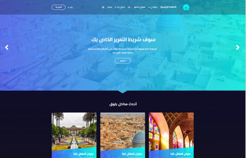
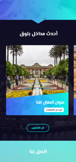
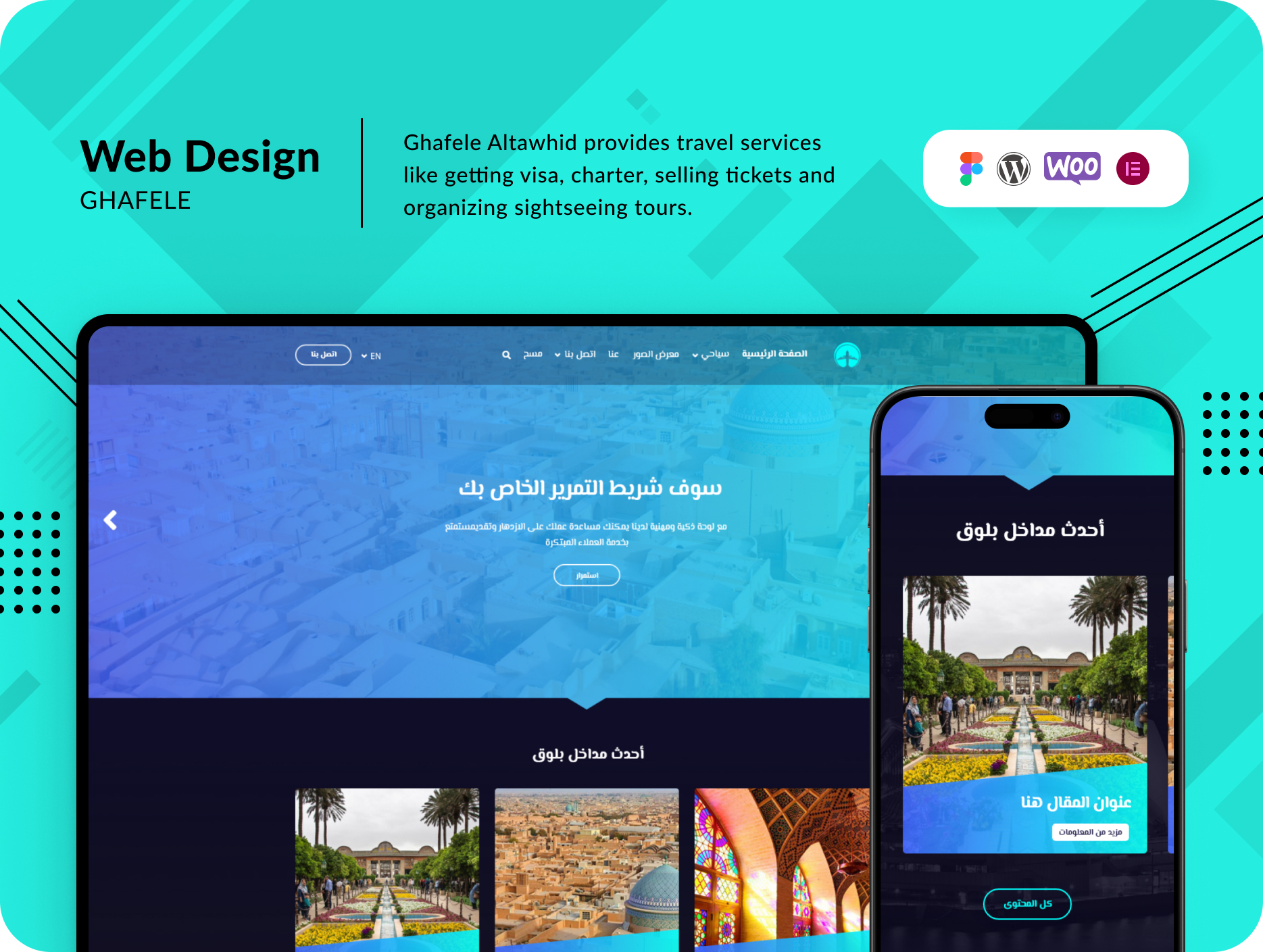
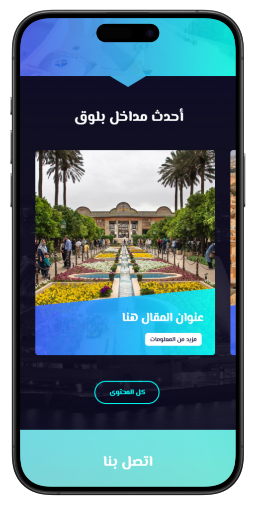
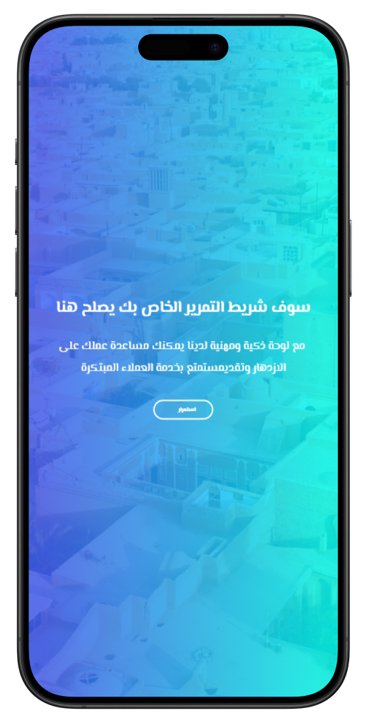
One of the primary challenges I encountered was the stark contrast between the project’s dark design and the company’s light logo. I had to create a design that not only incorporated dark colors but also remained consistent with the brand identity guidelines. Catering to both Middle Eastern and European customers further complicated the design process, as it required a harmonious blend of aesthetics to appeal to both demographics.
To address these challenges, I initiated a two-fold strategy. First, I revamped the company’s brand identity book to provide a clearer and more adaptable framework. Next, I focused on enhancing the user experience and user flow to cater to the distinct preferences of European and Middle Eastern customers.
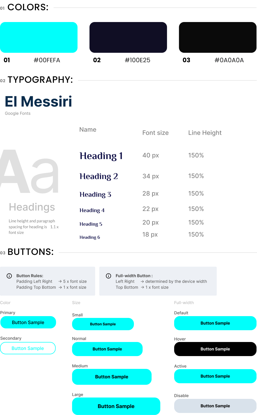
Brand Identity Enhancement: I worked diligently to align the brand identity with the project’s dark design. A harmonious blend of light blue and navy blue was employed to bridge the gap. While European customers gravitate towards dark colors like navy blue, I introduced a contrast of light blue to infuse vibrancy into the design. This not only upheld the brand’s image but also made the user interface visually appealing.
User Experience Transformation: My journey to improve user experience began with extensive research. I drew inspiration from past projects related to tourism services and conducted an in-depth analysis of the Expedia website, a benchmark in the industry. The culmination of this research led to a redefined user journey for Ghafele Altawhid.
From the moment a user visits the site, I ensured they felt welcomed and nurtured trust in the services offered. I streamlined processes for requesting visas and purchasing tour packages, resulting in a seamless and user-friendly experience.
Continuous Improvement: My commitment didn’t end with the project’s launch. Over the following six months, I closely monitored user interactions with the website. Any areas requiring improvement were identified and addressed promptly, ensuring a consistently high-quality user experience.
The collaboration with Ghafele Altawhid resulted in a project that not only overcame the initial design challenges but also set new standards for user satisfaction. The revamped brand identity and enhanced user experience continue to empower customers to embark on memorable journeys across the Middle East and beyond.



Elevate your project with my Top Rated expertise on Upwork. Experience seamless collaboration and quality results.