DinaDev

Have Patience
logo

MagicTouch

  • UI/UX
  • Brand Identity
  • Theme Development
  • Figma Design
img
img
case study
About The Project

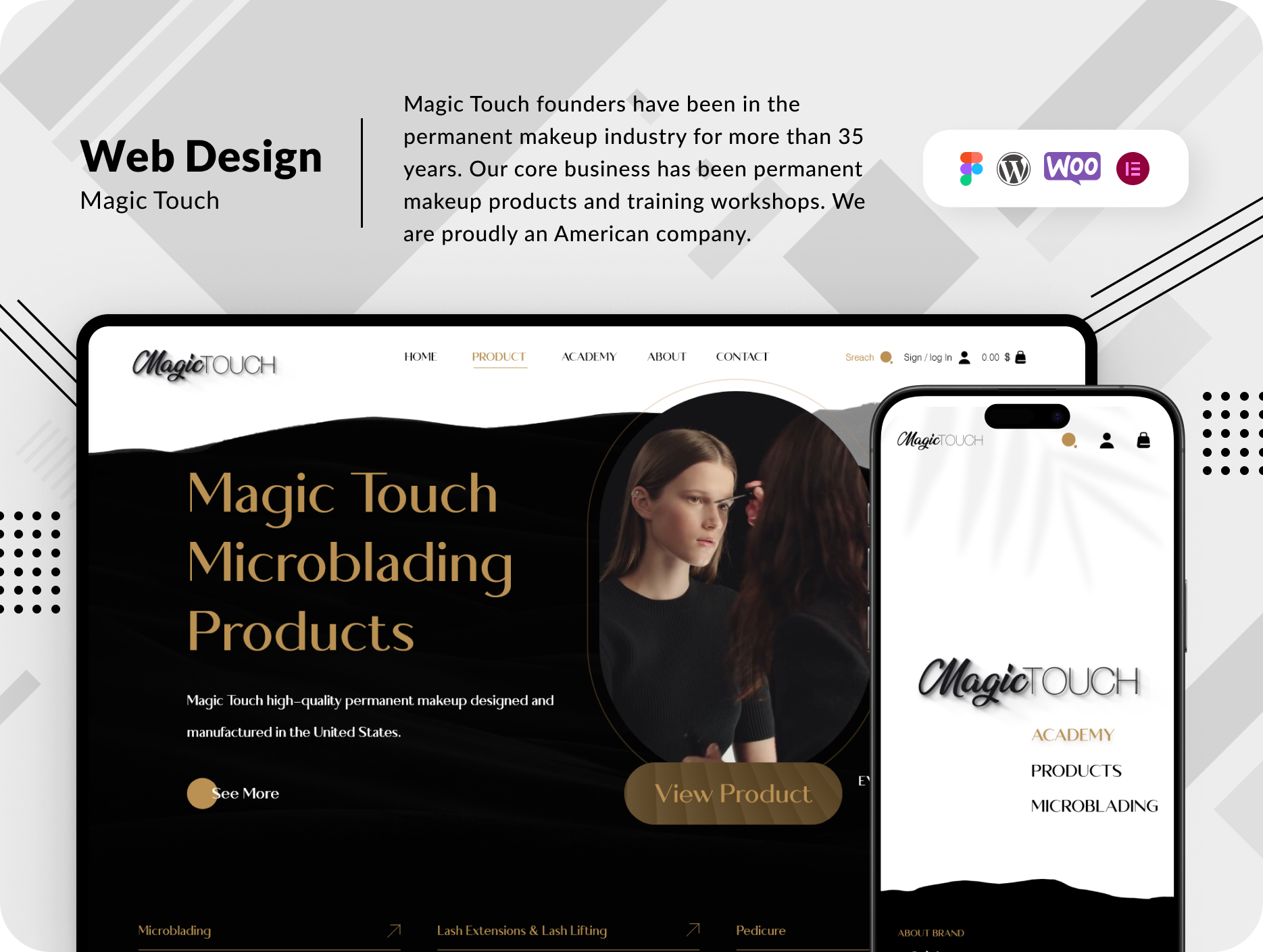
Magic Touch, an esteemed player in the permanent makeup industry with over 35 years of experience, is an American company renowned for its high-quality permanent makeup products and comprehensive training workshops.


Challenges

Magic Touch had an existing Shopify website that, while functional, lacked the flexibility and customizability required to meet their expanding needs. The customer sought a tailored customer system and specific plugins to foster business growth on their platform. Furthermore, with Magic Touch’s strong presence in the United States, it was imperative to create a visually striking and high-quality website that resonated with their brand.

Solutions

  • Understanding Brand Identity: To address these challenges, the project began with a series of in-depth sessions with the Magic Touch marketing team. These sessions served a dual purpose: gaining a comprehensive understanding of the brand identity and re-evaluating the project requirements. This foundation was pivotal in shaping the project’s direction.
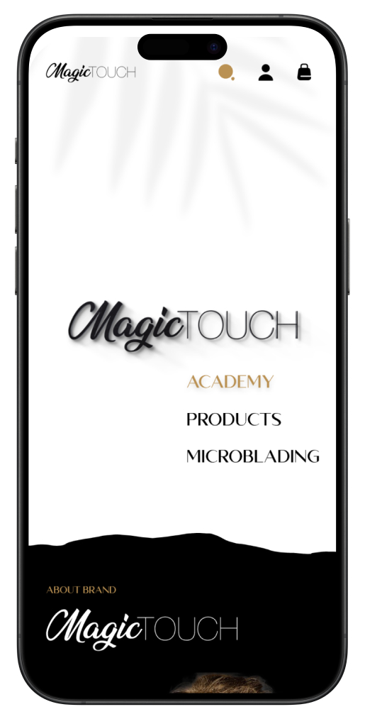
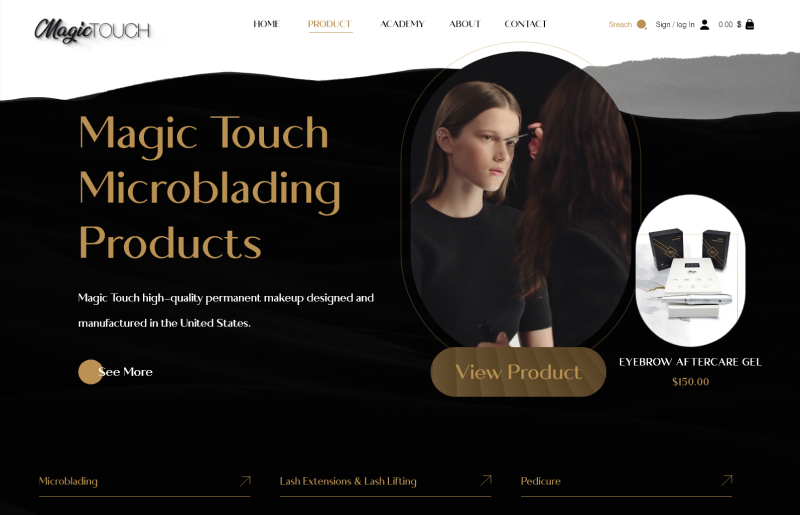
  • Elegance and Quality: The website’s design was a critical aspect of this project. To convey the elegance and quality of American-made products, a color scheme of black and white was employed. These classic colors resonated with the brand’s commitment to delivering top-tier products. In addition to this, a highly popular color in the fashion industry was incorporated to infuse a modern touch into the design.
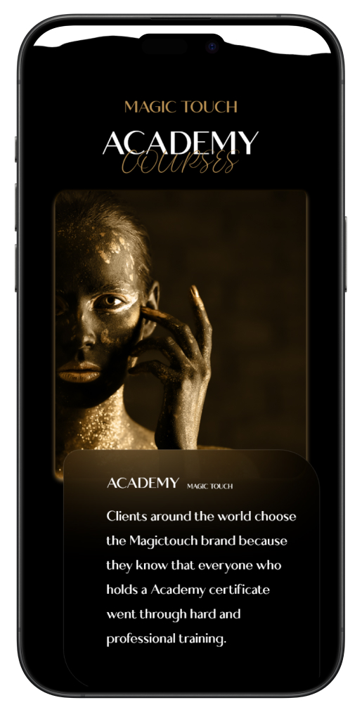
  • Utilizing Brand Ambassadors: Magic Touch boasts well-known models with striking bronze and gold features. Leveraging the star power of these models, their images were prominently featured throughout the website. This not only added a touch of glamour but also reinforced the brand’s credibility.
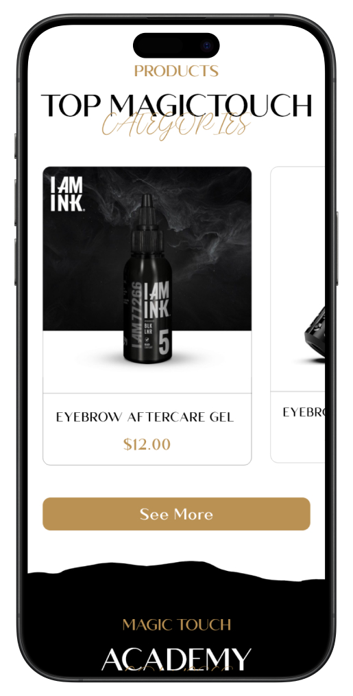
    Strategic Website Sections: The organization of sections on the homepage was strategically planned to align with Magic Touch’s marketing goals. This included showcasing their product line, highlighting their training workshops, and integrating customer testimonials for trust-building. The design was carefully executed to engage and inform visitors effectively.
  • Technology Stack: For the website’s implementation, the choice of technology was paramount. WooCommerce and WordPress were selected for their flexibility and reliability. To make the website design process smooth and intuitive, Elementor was employed as the primary page builder. This ensured that the site was not only aesthetically pleasing but also user-friendly and easily navigable.
    Responsive Design: In today’s diverse digital landscape, the importance of a responsive design cannot be overstated. The website was meticulously developed to ensure it functioned flawlessly on all devices, from desktops to smartphones. This approach maximized the reach and accessibility of Magic Touch’s offerings.

Results:
The collaboration between the Magic Touch team and the web development experts yielded an exceptional website that captured the brand’s essence and met their specific requirements. The new website not only exuded elegance and quality but also served as an effective marketing tool, aligning seamlessly with the brand’s vision.
This transformation enabled Magic Touch to engage with a broader audience, both within the United States and beyond. With a user-friendly interface, enhanced visuals, and the flexibility to incorporate essential plugins, Magic Touch is now better equipped to expand its business and further solidify its position as a leader in the permanent makeup industry.

Magic Touch’s journey to enhance its online presence was a resounding success, and this case study stands as a testament to the power of understanding a brand’s identity and translating it into an impactful digital experience.
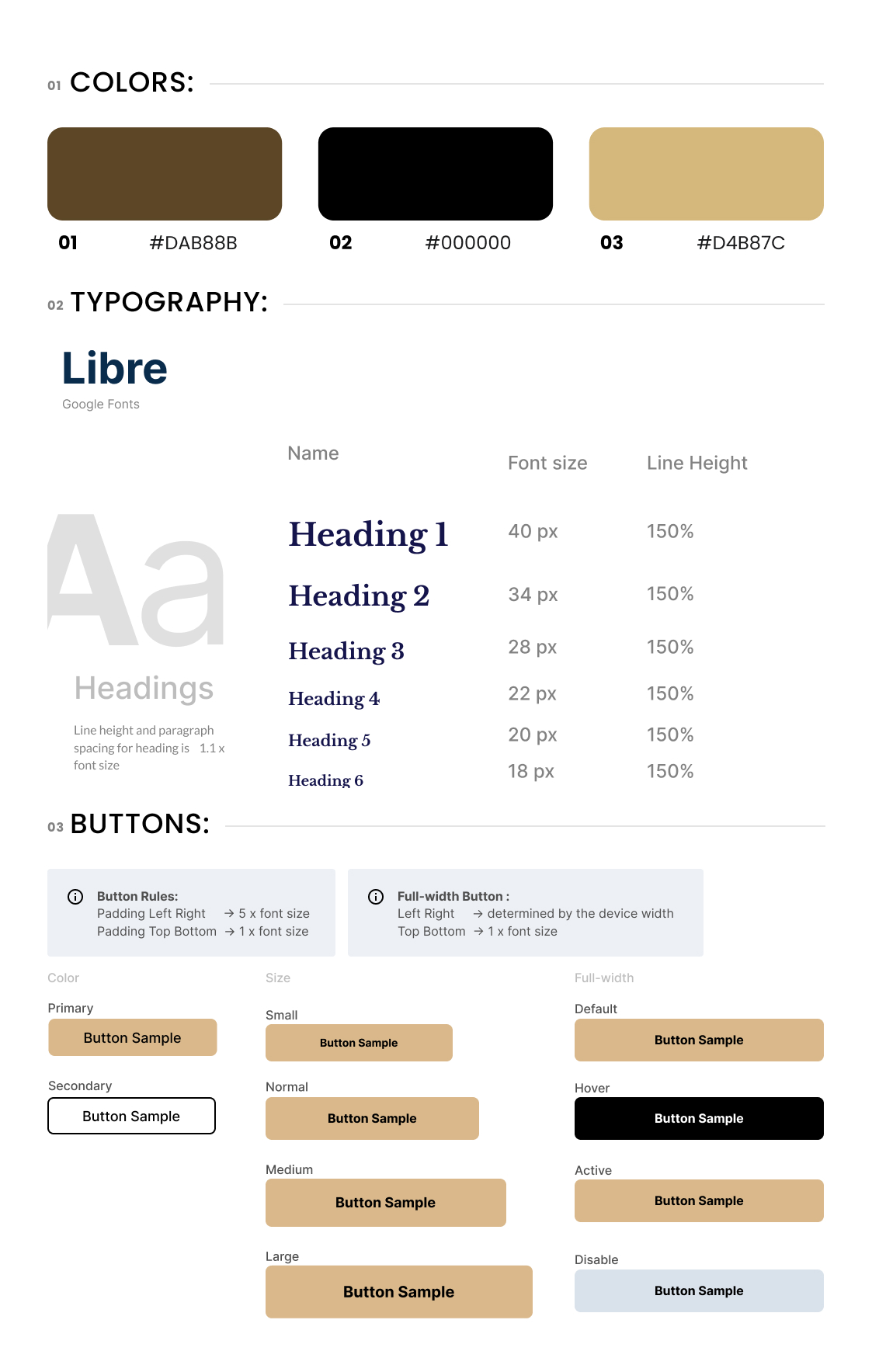
StyleGuide

Desktop Landing

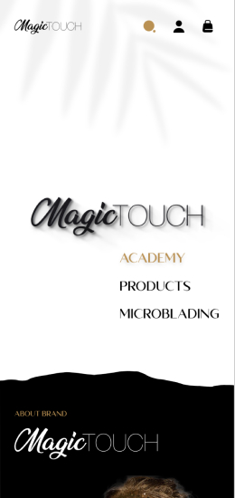
Mobile Landing