DinaDev

Have Patience
logo

Raika33 Shop

  • UI/UX
  • Figma Design
  • WordPress
  • Theme Development
img
img
case study
About The Project

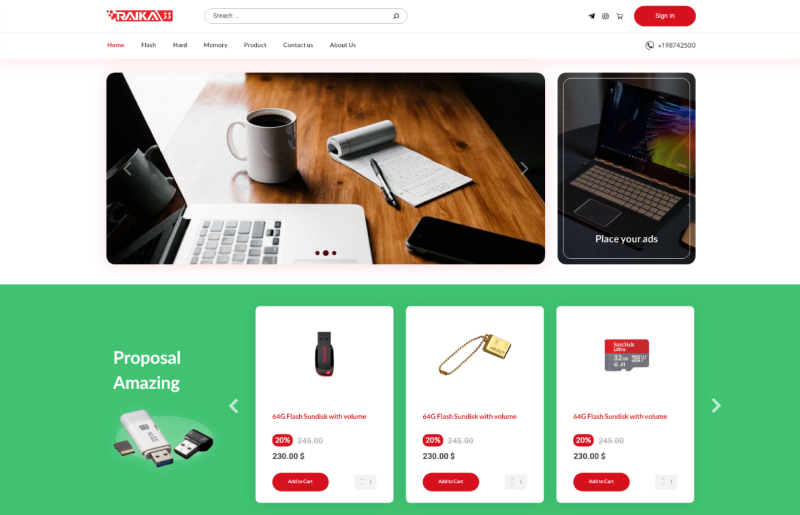
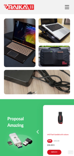
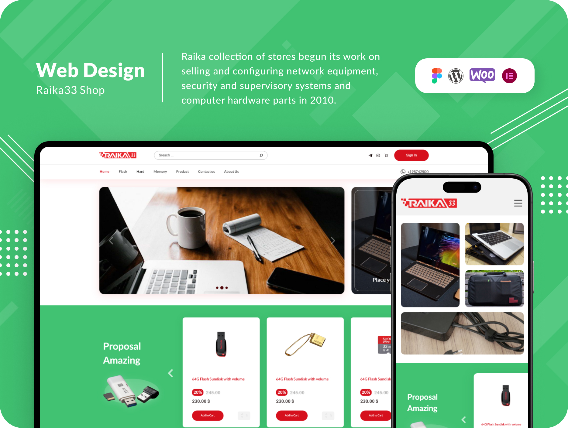
Raika Collection of Stores, founded in 2010, initially focused on network equipment, security and surveillance systems, and computer hardware components. With a strong presence in the Middle East, they launched an online store, which primarily dealt with computer hardware, flash memory, and network equipment. Their unique selling point was an exclusive shipping system that set them apart in the market.


Challenges

After a successful decade serving computer experts in the hardware and network equipment niche, Raika33 decided to shift its focus to flash memory, hard drives, and notebooks. The primary challenge was aligning their website development with this new objective. They began with limited customer data and needed to revamp their online presence.

Solutions

Raika’s journey to transform its online store was a comprehensive one. Here’s how they tackled their challenges:

  1. Customer Insights Gathering:
    Raika initiated a series of meetings to gather additional data from customers. This helped them gain a clearer understanding of their goals for the online shift.
  2. Goal Prioritization:
    With insights from customers, they worked closely with their marketing team to prioritize objectives. This, in turn, guided the website’s design and implementation process.
  3. Wireframing and Redesign: Wireframing was employed to reimagine and optimize traditional procedures. The focus was on simplifying navigation for customers interested in flash memory, hard drives, and notebooks, enabling clear and swift comparisons and purchases.
  4. User Experience Enhancement:
    After defining processes and services, Raika integrated the color red from their brand identity into the design. Red, symbolizing courage and danger, was used judiciously to convey a sense of courage to customers.
  5. Visual Aesthetics: The design process emphasized simplicity while ensuring visually pleasing images. They conducted standard and high-quality product photography to provide top-notch product images.
  6. Dedicated Discounts Section: In collaboration with the marketing team, Raika established a dedicated discounts section. Here, the strategic use of red and green colors was employed. The prominence of green conveyed a sense of a good deal, while the inclusion of red from the brand identity added urgency. Rounded edges were used to balance the design and avoid overuse of red.
  • Results:
    The transformation of Raika’s online store led to several positive outcomes:
  • Customers found it easier to navigate the website, resulting in increased sales of flash memory, hard drives, and notebooks.
  • The integration of the color red from the brand identity resonated with customers, conveying a sense of courage and trust.
  • High-quality product images enhanced the overall shopping experience, leading to higher customer satisfaction.
  • The dedicated discounts section with its color scheme contributed to a boost in sales by creating a sense of value and urgency.

    In conclusion, Raika Collection of Stores successfully revamped its online store, aligning it with its new focus on flash memory, hard drives, and notebooks. By prioritizing customer insights and employing a strategic design approach, they significantly improved the online shopping experience, resulting in increased sales and enhanced customer satisfaction.

StyleGuide

Desktop Landing

Mobile Landing