
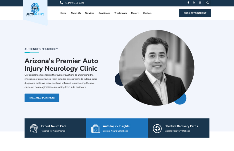
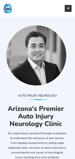
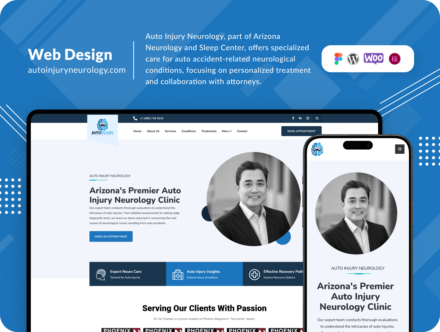
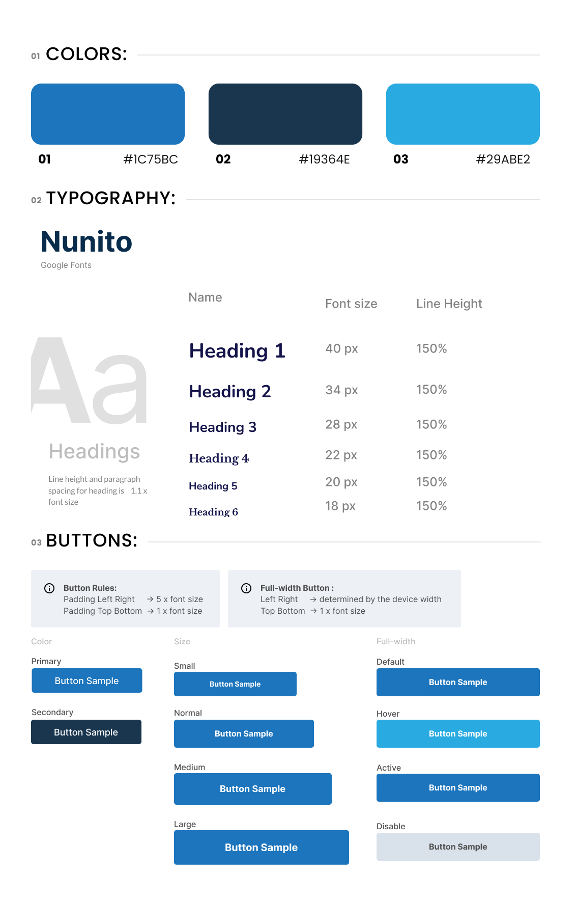
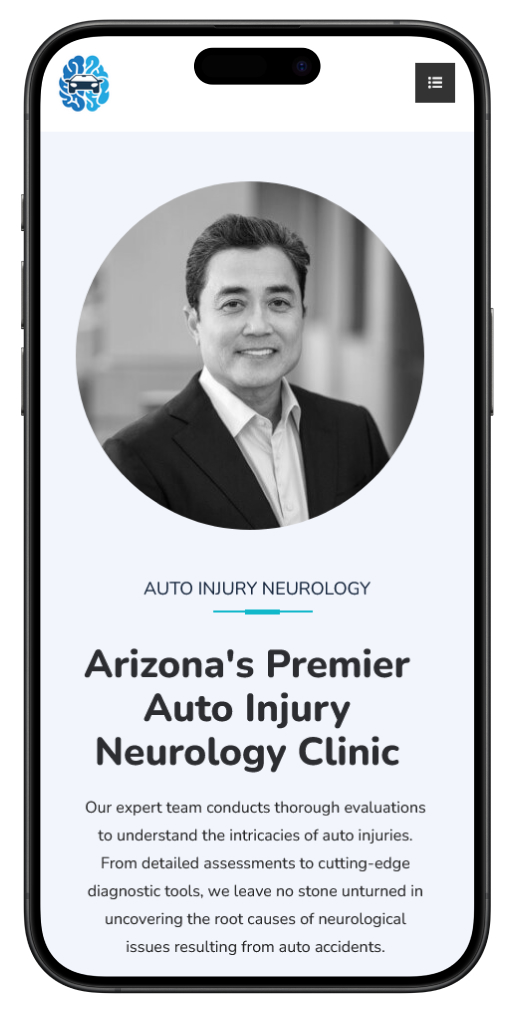
One of the primary challenges encountered while redesigning the Auto Injury Neurology website was the vast amount of informative content it contained. The website needed to convey a considerable amount of information without overwhelming the user, making excellent user experience (UX) a top priority. Additionally, achieving a modern and clean design was crucial to align with the client’s goals. The informative pages required numerous sections to present specific information at each stage while avoiding overwhelming the user with unnecessary details. Furthermore, given the substantial content, maintaining an acceptable website speed was essential to ensure optimal performance.
To address the challenge of presenting a large amount of information while maintaining an excellent user experience, I implemented a carefully crafted design strategy. I focused on creating a clean and modern layout with intuitive navigation, allowing users to easily access the information they need without feeling overwhelmed. Each informative page was divided into distinct sections, ensuring that relevant information was presented in a structured manner. By utilizing concise and visually appealing content blocks, we minimized the risk of information overload while maximizing user engagement.
To optimize website speed, I employed various techniques, including image optimization, caching, and minification of resources. By reducing the file sizes of images and minimizing HTTP requests, I significantly improved loading times without compromising the quality of content. Additionally, I utilized a content delivery network (CDN) to distribute content geographically, further enhancing performance for users across different regions.
➤ Results:
The redesigned Auto Injury Neurology website successfully addressed the challenges posed by its informative content while achieving the client’s objectives. The implementation of a clean and modern design, coupled with intuitive navigation, significantly enhanced the user experience. Visitors can now easily navigate through the website and access relevant information without feeling overwhelmed, leading to increased user engagement and satisfaction.
Furthermore, the optimization efforts resulted in notable improvements in website speed, ensuring that users experience fast and seamless performance across various devices and network conditions. This optimization not only enhances user satisfaction but also positively impacts search engine rankings, leading to increased visibility and traffic for the website.
Overall, the redesign of the Auto Injury Neurology website successfully achieved its goals of delivering a modern, informative, and user-friendly online experience, ultimately contributing to the center’s mission of providing expert medical support for auto injury-related conditions.



Elevate your project with my Top Rated expertise on Upwork. Experience seamless collaboration and quality results.