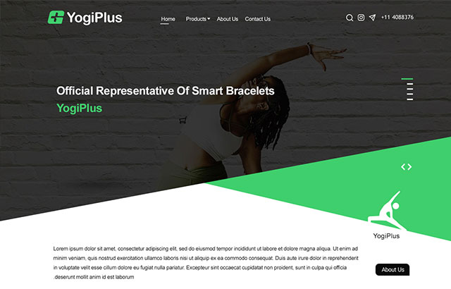
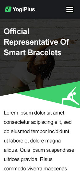
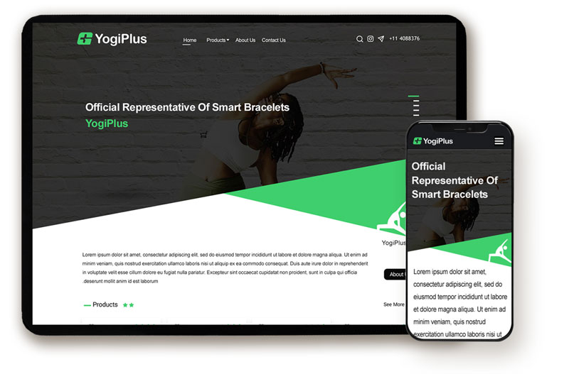
Despite our success in physical retail, YogiPlus recognized the need to expand into the digital realm. The challenge lay in defining our website’s primary objective among the many goals we had in mind. By carefully prioritizing and grouping these objectives, we were able to pinpoint the central goal and devise clear solutions to achieve it.
Rather than diving straight into website design, I conducted several meetings with senior managers to ascertain YogiPlus’s primary aim in establishing a digital presence. Leveraging our company’s CRM system, I gained valuable insights into our main customer base and their unique characteristics. Collaborating closely with the marketing team, I identified effective lead generation channels for the website.
Proceeding to wireframing and user experience design, I placed a strong emphasis on our core customer personas and their desires. By setting goals for an aesthetically pleasing design, particularly for our mats and yoga blocks, we sought to engage our target audience effectively.
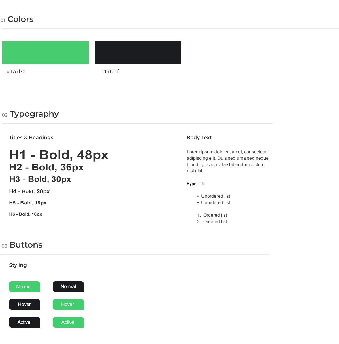
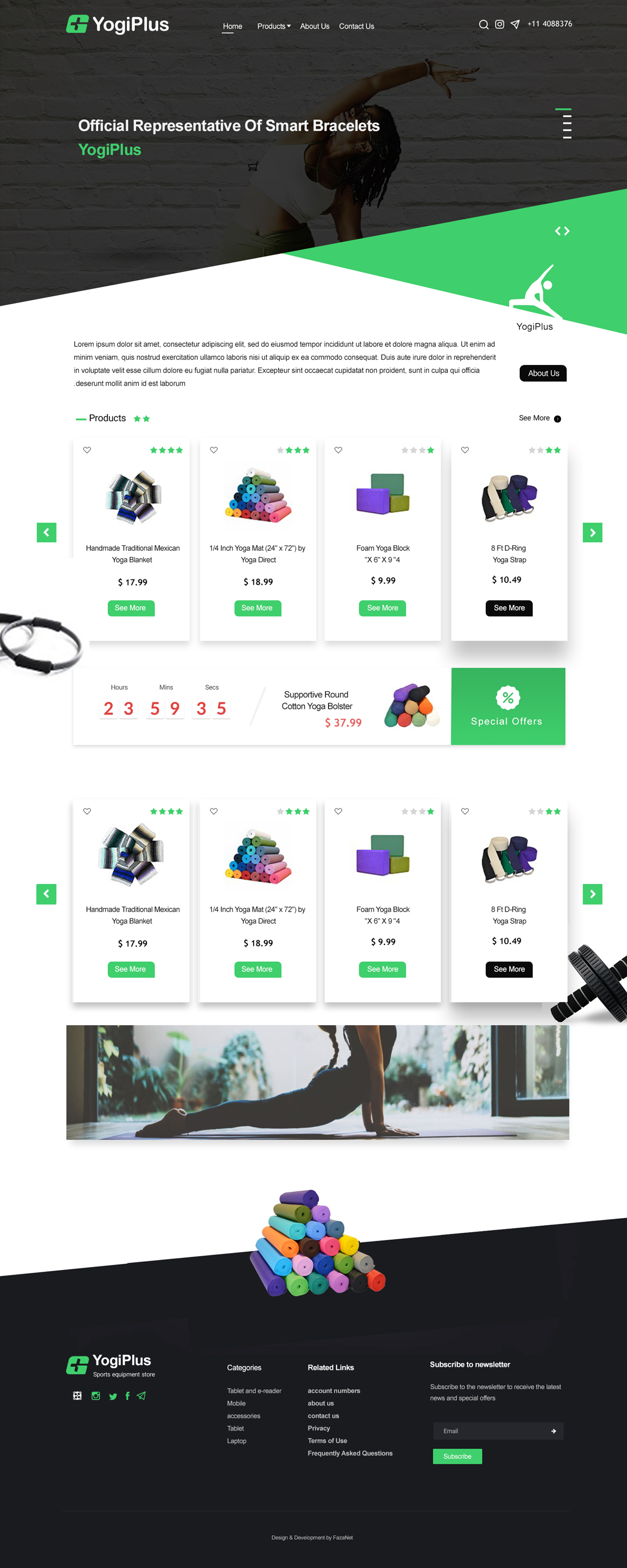
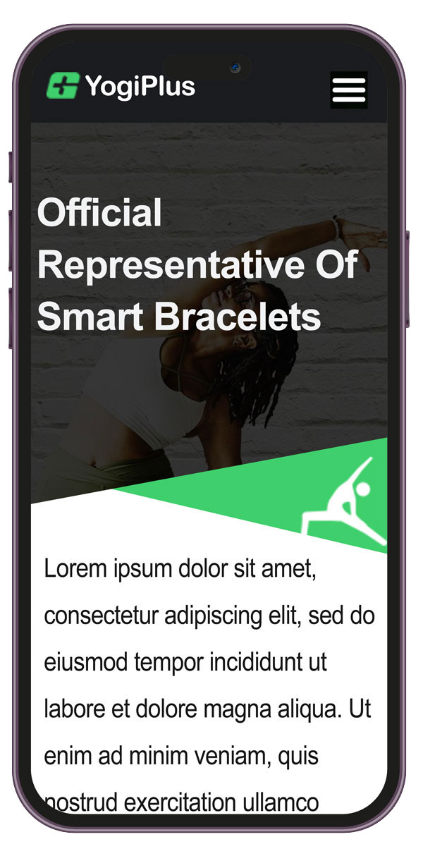
The website’s design was inspired by the YogiPlus brand identity book. Utilizing green and black colors, we created a contrasting yet serene atmosphere, instilling a sense of peace in our site users. Green, known for its calming properties in color psychology, proved to be the perfect choice for our platform.
Our objective was to prominently showcase our best-selling and recommended products in dedicated sections of the site. Additionally, we aimed to entice hesitant customers by displaying enticing offers alongside the original prices.
Following the successful launch of YogiPlus, we initiated several media campaigns within the first month, resulting in numerous leads. During this period, our primary focus was on enhancing user experience, ensuring that the website was optimized for a seamless browsing journey. The subsequent three months witnessed remarkable results as we fine-tuned the site, culminating in an impressive 5% conversion rate increase. Four months after the project’s initiation, the YogiPlus website was triumphantly launched.


Elevate your project with my Top Rated expertise on Upwork. Experience seamless collaboration and quality results.