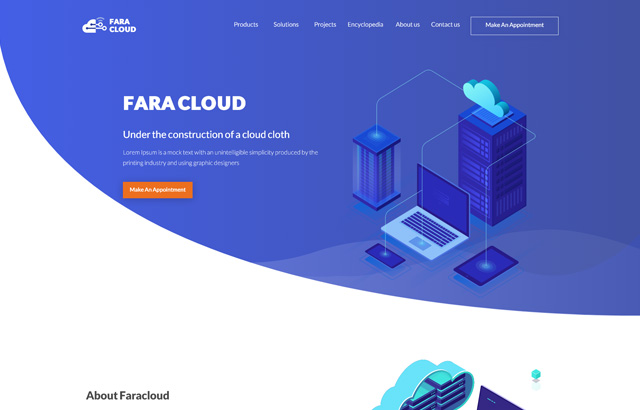
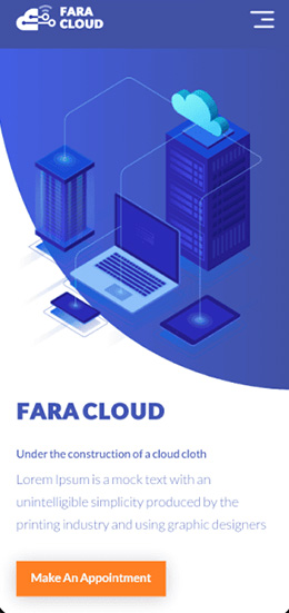
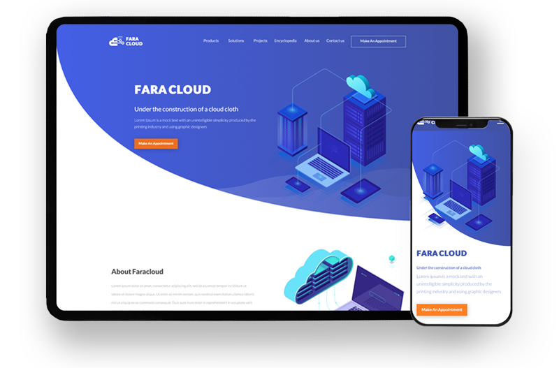
As a trusted provider of private cloud infrastructure services, FaraCloud sought to expand its offerings and establish a strong B2C presence. To achieve this, the company needed a comprehensive website that effectively communicates its cloud services to visitors while offering easy navigation to explore services and available offers.
To design a website that effectively showcases the services and drives sales, extensive competitor analysis and customer persona research were conducted. Through thorough examination of competing services and insights gathered from the Alexa website, the best user experience for FaraCloud’s customers was identified.
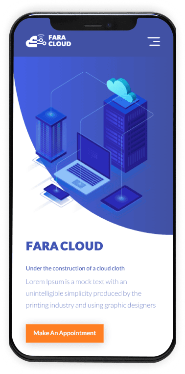
The main page features a concise yet impactful description of the cloud services to provide new customers with a clear understanding of what FaraCloud offers. The design, inspired by FaraCloud’s brand identity book, employs a simple yet distinctive aesthetic, prominently featuring the brand’s signature blue color.
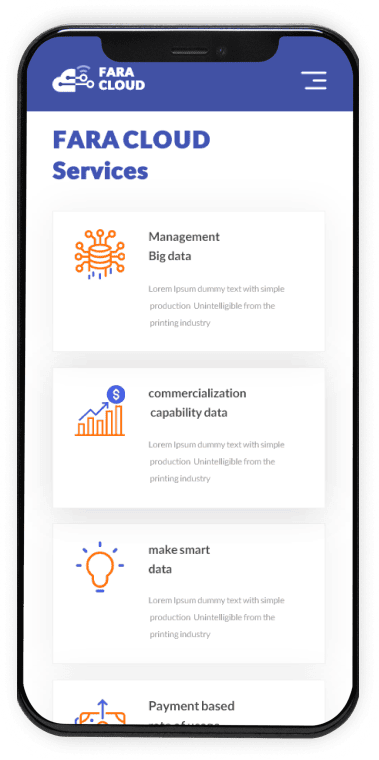
Establishing trust with FaraCloud’s customers was a top priority. The second section of the website provides detailed information about the company. Customers seeking further details can easily access the “About Us” page by clicking on the call-to-action button. To avoid overwhelming visitors with excessive information, this section focuses on highlighting the range of services offered, types of customers served, and testimonials from satisfied clients, thereby building credibility.
However, trust alone was not enough. The benefits of using FaraCloud’s services were effectively communicated through compelling copywriting and an appealing design. By emphasizing the advantages customers would gain, the website instills confidence and encourages conversions.
The user experience of purchasing services was streamlined to ensure simplicity and transparency. The goal was to enable customers to swiftly and easily complete their purchases, minimizing unnecessary steps and prominently displaying the cart on internal pages, keeping it within the customer’s view at all times.




Elevate your project with my Top Rated expertise on Upwork. Experience seamless collaboration and quality results.