DinaDev

Have Patience
logo

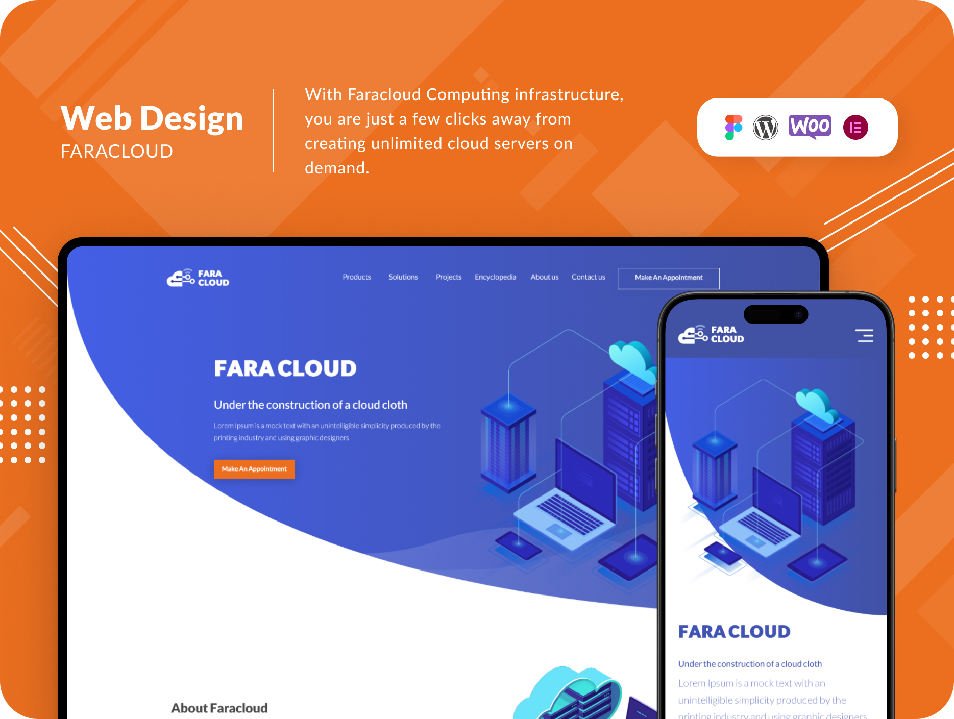
FaraCloud

  • UI/UX
  • Figma Design
  • WordPress
  • Theme Development
img
img
case study
About The Project

FaraCloud Computing offers a flexible and scalable cloud infrastructure, putting a world of possibilities at your fingertips. With just a few clicks, users can create on-demand cloud servers, equipped with multiple cloud storage disks. The management of cloud data center communications is made effortless through the use of firewalls and a combination of private and public networks.


Challenges

FaraCloud’s primary focus had been on providing private cloud infrastructure services to organizations. However, they faced a pivotal challenge when they decided to extend their services to individual customers (B2C). The key challenge was the need for a user-friendly website that would allow all visitors to access information about cloud services effortlessly and navigate seamlessly through the available services and offers.

Solutions

To tackle this challenge, FaraCloud embarked on a journey of transformation, aiming to create a user-friendly website that caters to B2C clients. The solutions implemented were innovative and meticulously designed to enhance user experience.

  1. Competitor Analysis:
    The first step was to conduct an in-depth analysis of competitors and understand their customers’ preferences. This research provided valuable insights and guidance for creating the best user experience for FaraCloud’s clients. The analysis was instrumental in shaping the new website.
  2. User-Centric Design:
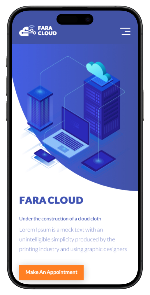
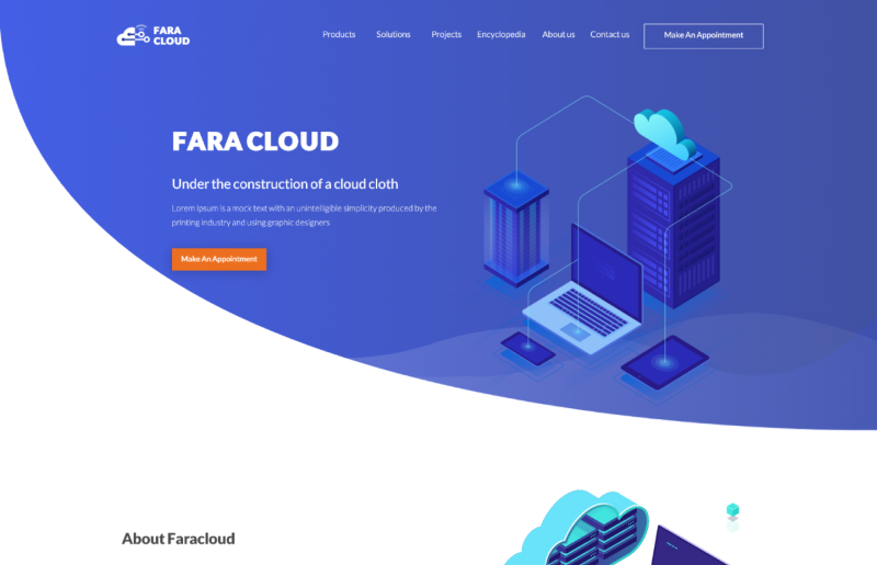
    FaraCloud’s new website boasts a user-centric design, featuring a clear and concise description of cloud services on the main page. This allows new customers to quickly grasp the offerings. The design is characterized by a simple yet distinctive approach, using the brand’s signature blue color. This design instills trust, making visitors feel at ease.
  3. Information About the Company:
    To establish trust with customers, FaraCloud dedicated a section to provide detailed information about the company. A prominent “About Us” page was easily accessible through a call-to-action button. This section is designed to provide clear and trustworthy data, including the number of services, types of customers served, and customer testimonials.
  4. Highlighting Benefits:
    Building trust was just the beginning. FaraCloud also emphasized the benefits of using their services through compelling copywriting and an aesthetically pleasing design. This approach reinforced the value proposition and showcased the advantages of choosing FaraCloud.
  5. Simplified Service Purchase:
    The user experience for purchasing services was designed with simplicity in mind. The goal was to enable customers to acquire services swiftly and transparently. This meant streamlining the process and prominently displaying the shopping cart on internal pages for easy access.

Conclusion:
FaraCloud’s transformation journey to cater to B2C clients has been nothing short of remarkable. By addressing the challenges with innovative solutions, they have created a user-friendly website that enhances the overall customer experience. The focus on trust, simplicity, and value has set FaraCloud on a path to even greater success in the world of private cloud infrastructure services.
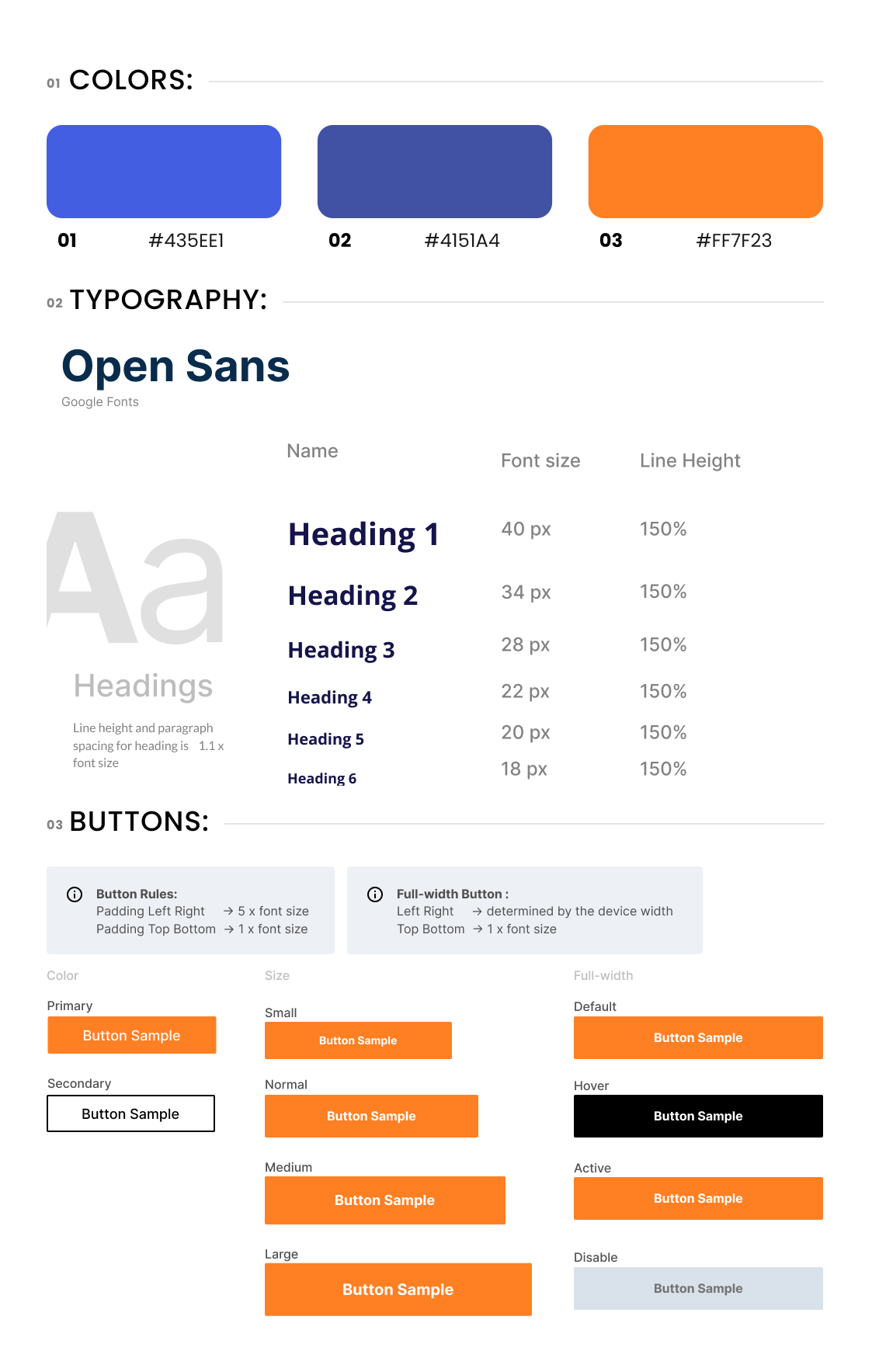
StyleGuide

Desktop Landing

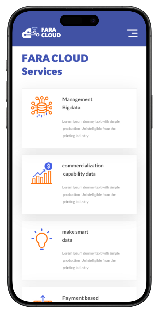
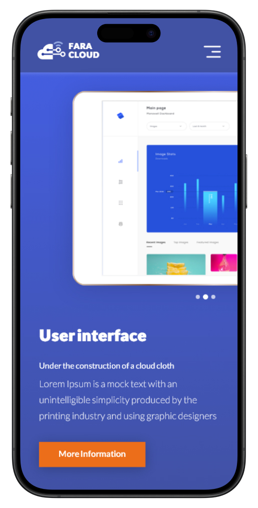
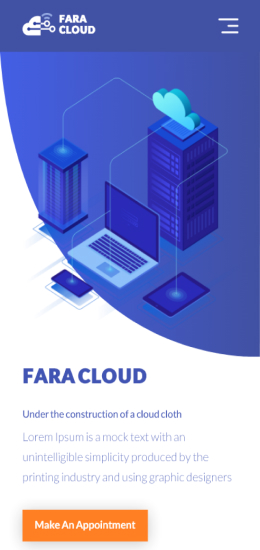
Mobile Landing