DinaDev

Have Patience
logo

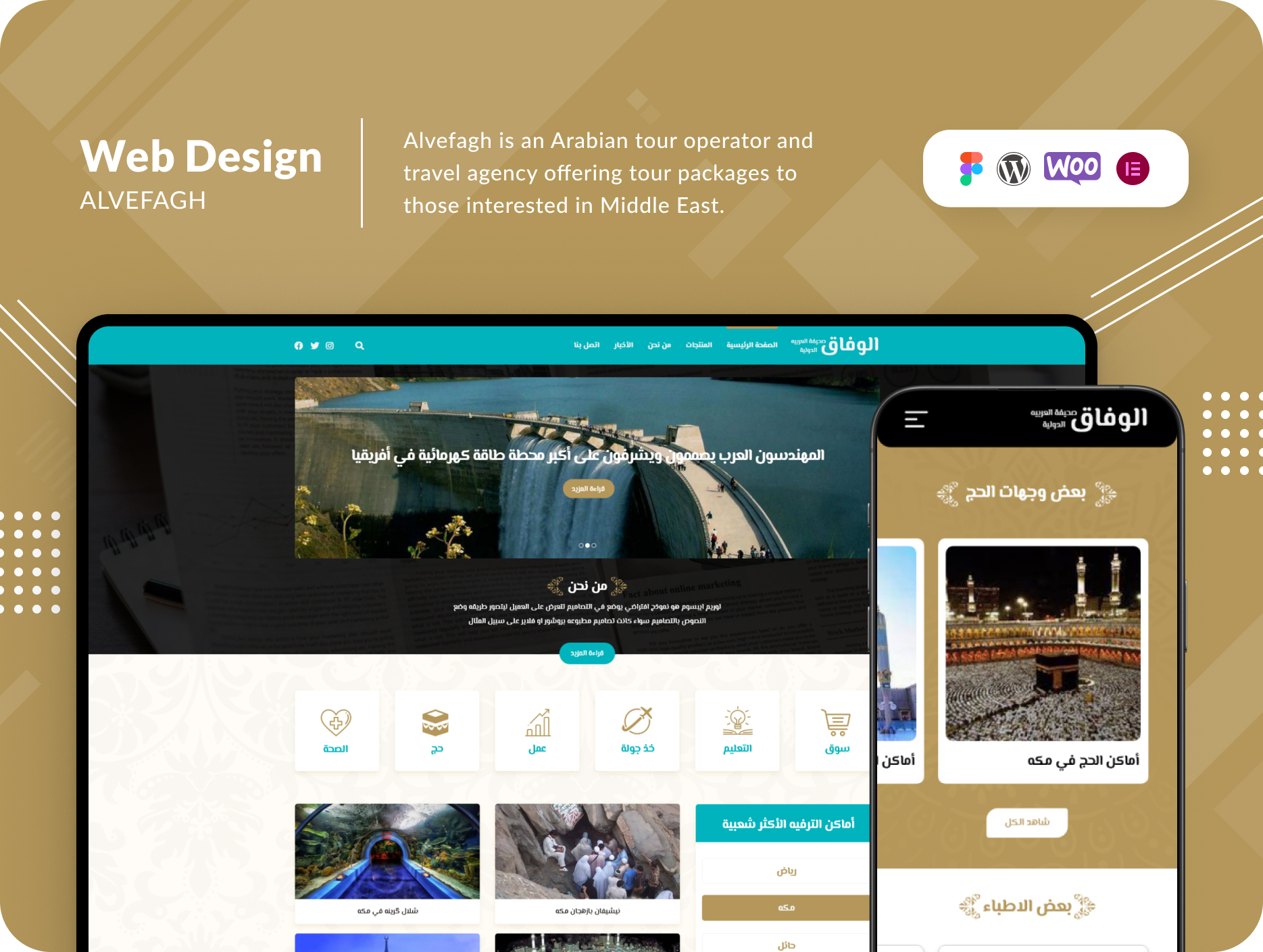
Alvefagh Travel

  • UI/UX
  • Theme Development
  • WordPress
  • Figma Design
img
img
case study
About The Project

Alvefaq is a distinguished Arabian tour operator and travel agency that specializes in curating extraordinary tour packages for individuals with a passion for exploring the Middle East. They are dedicated to providing comprehensive services crucial for a smooth journey throughout the region, offering everything from captivating landscapes to facilitating Iran visa acquisition and arranging seamless transportation.


Challenges

Alvefaq, despite being a prominent player in the Arabian travel industry, encountered a significant challenge: converting visitors from their marketing channels into active users on their website. The previous website had various issues with the organization of its sections, making it difficult for customers to accomplish their primary goal – purchasing tour packages. This issue is all too common in the tourism industry, where the complexity of navigating through a website can lead to potential frustrations for visitors.

Solutions

To address these challenges, we embarked on a strategic approach aimed at enhancing Alvefaq’s online presence. Here’s how we tackled these issues:

  1. Captivating Visuals and Clear Messaging:
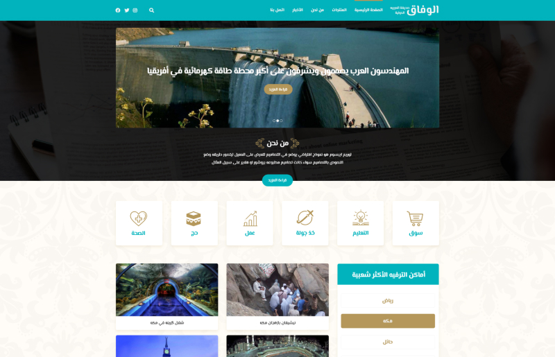
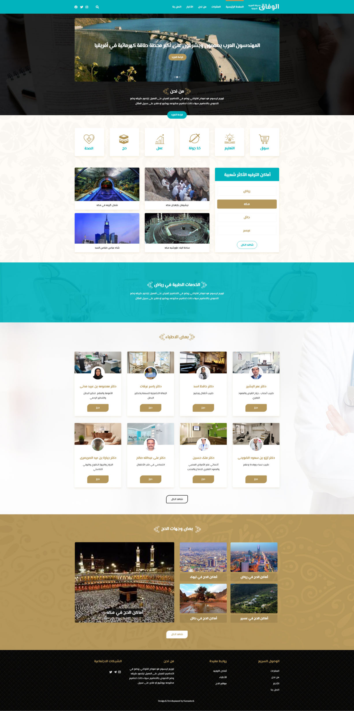
    We began by featuring striking images of the most sought-after tourist destinations that Alvefaq customers frequently choose. These images were complemented by a concise description of the core essence of the business in the first section of the website. The intention was to guide visitors seamlessly towards the main services and, ultimately, the purchase of their desired tour package.
  2. Highlighting Core Services:
    In the subsequent section, I prominently displayed the primary services Alvefaq offers. Recognizing that visitors arriving through marketing channels might not have prior knowledge of Alvefaq, I provided detailed descriptions of the services on internal pages, ensuring potential customers were well-informed.
  3. Catering to Medical Tourism:
    A notable 35% of Alvefaq’s customers engage in medical tourism. To address this segment, I initiated a new project. This involved listing doctors and medical centers and offering appointment reservation options. In the fourth section, I introduced these medical professionals and centers, underscoring their significance. The second slide in the first section was dedicated to providing additional information to help customers understand the location of the appointment reservation section.
  4. Optimized Navigation:
    I revamped the website’s navigation menu, tailoring it to the specific needs and preferences of our site visitors. This optimization enabled users to swiftly achieve their goals and easily navigate through the site.


Results Achieved:

After the website’s transformation, I conducted a thorough assessment using Google Analytics over three months. The results were nothing short of impressive. Remarkably, despite no changes to Alvefaq’s marketing team and lead generation channels, sales increased by an astonishing 40%.Subsequently, I handed the reins of the Alvefaq site over to their digital marketing team after three months. This transition empowered them to further optimize their goals. My primary responsibility was to enhance the overall user experience and design, ensuring that every visitor’s journey on the site was as seamless as possible.

In conclusion, the strategic website transformation I implemented for Alvefaq not only resolved their challenges in converting visitors into active users but also led to a remarkable increase in sales. This case study serves as a testament to the power of user-focused web design and optimization in the travel and tourism industry. Alvefaq is now better equipped to provide its customers with exceptional travel experiences in the Middle East.
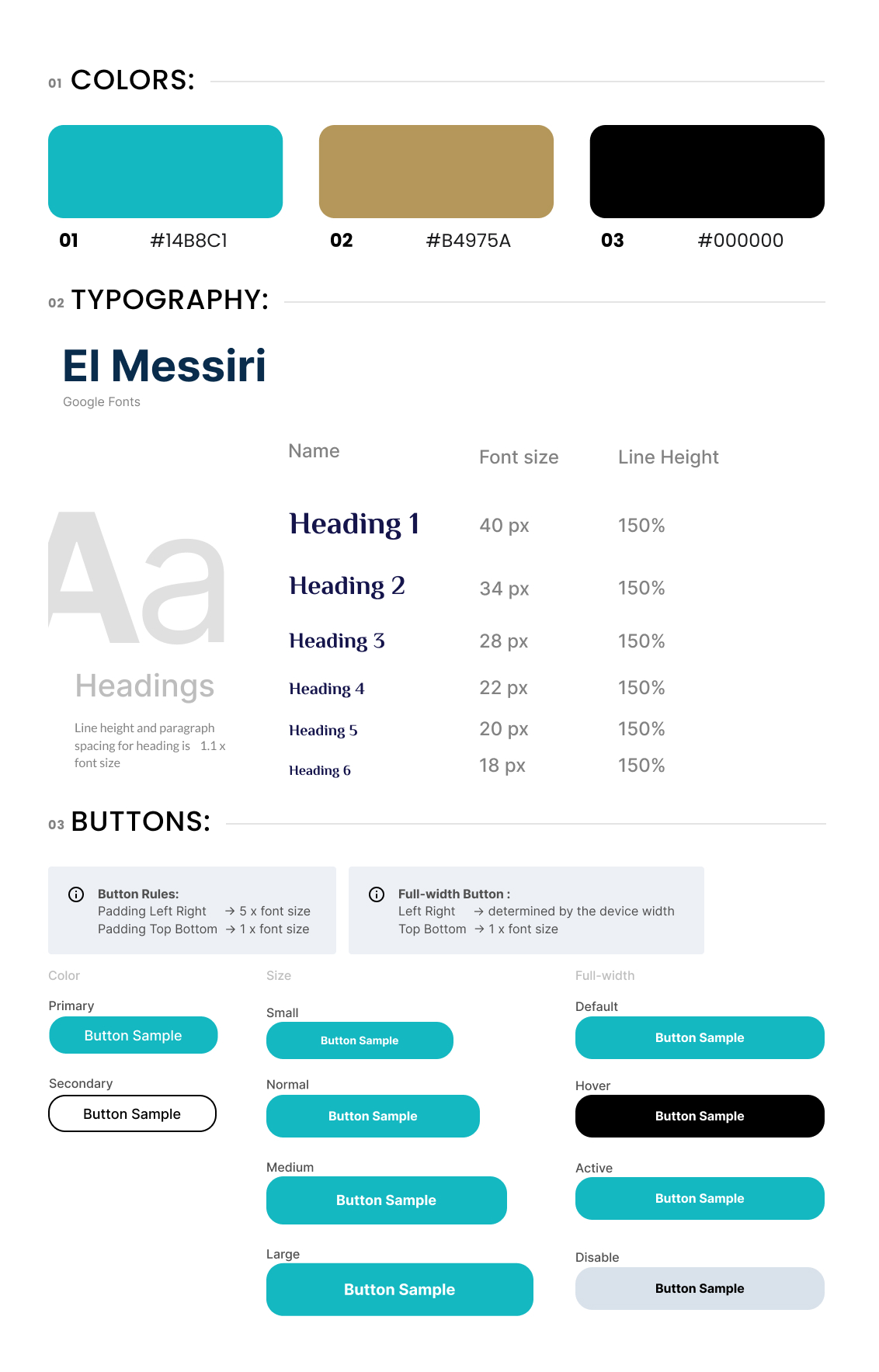
StyleGuide

Desktop Landing

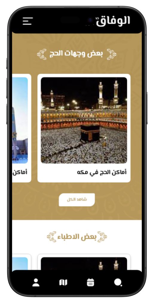
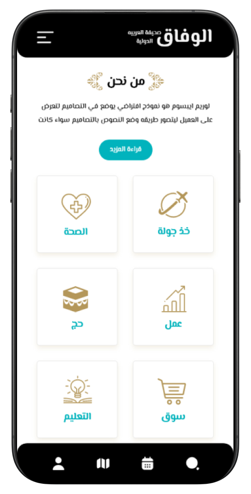
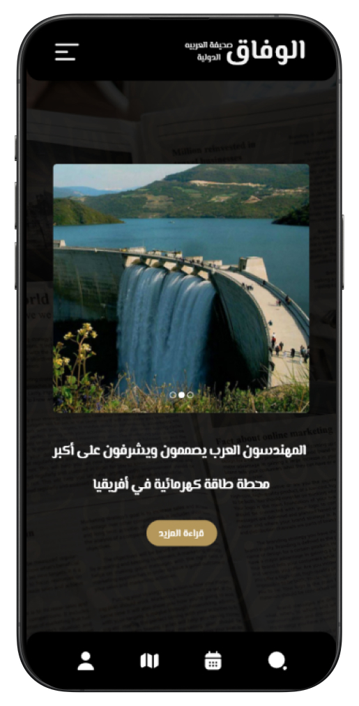
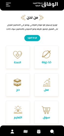
Mobile Landing