DinaDev

Have Patience
logo

No.1 Saffron

  • UI/UX
  • Figma
  • WordPress
  • Theme Development
img
img
case study
About The Project

No1 Saffron Company is a renowned saffron exporter, deeply rooted in the Middle East. The company has established itself as a premium-grade saffron provider in the market. With a history dating back over seventy years, No1 Saffron Company boasts a wealth of experience in saffron exports.


Challenges

No1 Saffron Company faced a unique set of challenges in its quest to modernize its online presence:

  • Misalignment with Brand Identity: The existing website did not align with the company’s new brand identity, causing a disconnect with customers.
  • Product Evolution: No1 Saffron had undergone significant changes in its product offerings, necessitating a reevaluation of how these products were presented on the website.
  • Organizational Complexity: The website’s structure required a thorough overhaul. Each landing page had distinct goals, making it a complex task to harmonize the overall design.

Solutions

To address these challenges and breathe new life into No1 Saffron Company’s online platform, the following solutions were implemented:

  • User-Centric Approach: Collaborating closely with No1 Saffron’s marketing team, the project began with user-centric sessions. This step aimed to understand the diverse user types and their specific needs.
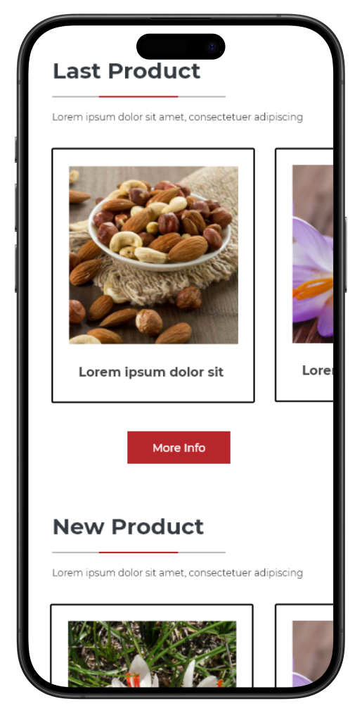
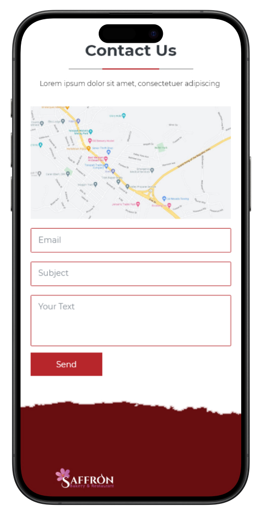
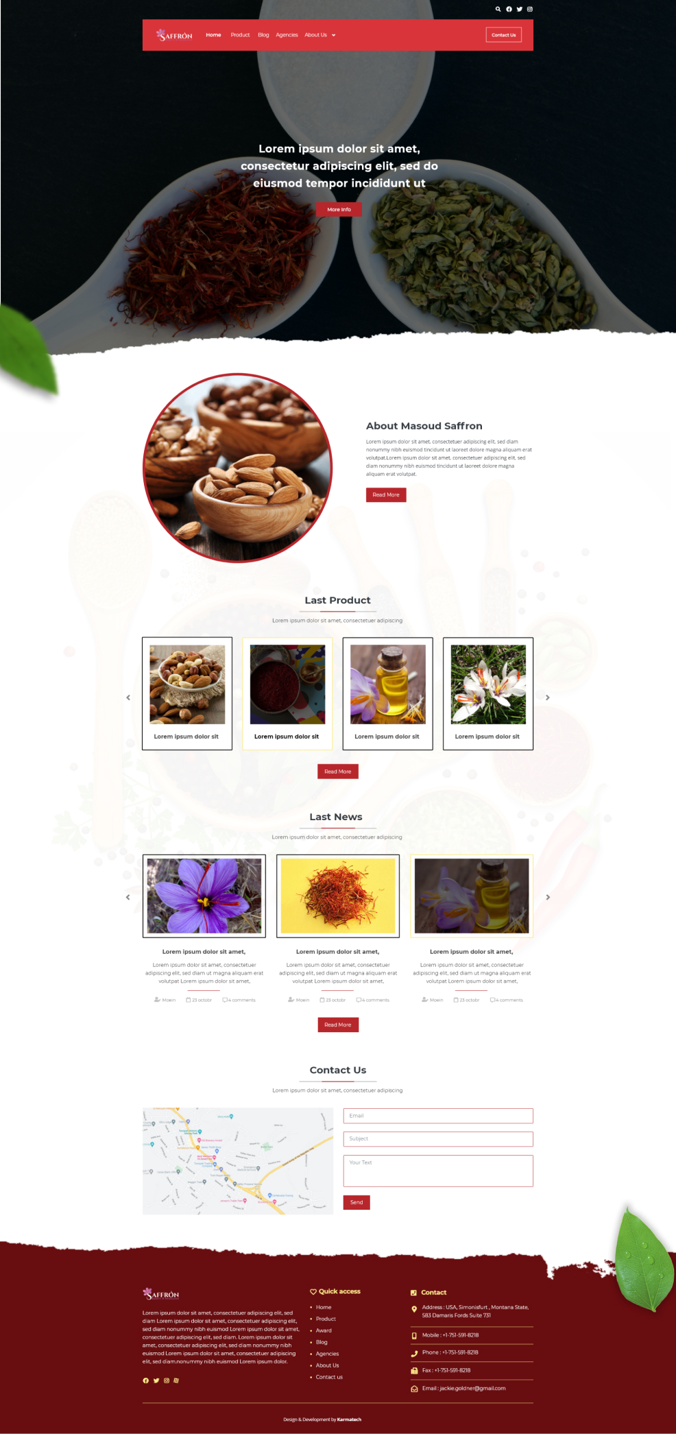
  • Strategic Page Design: With a clear understanding of user profiles, the website was redesigned with specific sections to cater to their unique requirements. Each landing page was meticulously crafted to align with its distinct goals, streamlining the user experience.
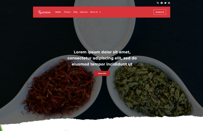
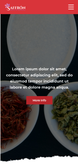
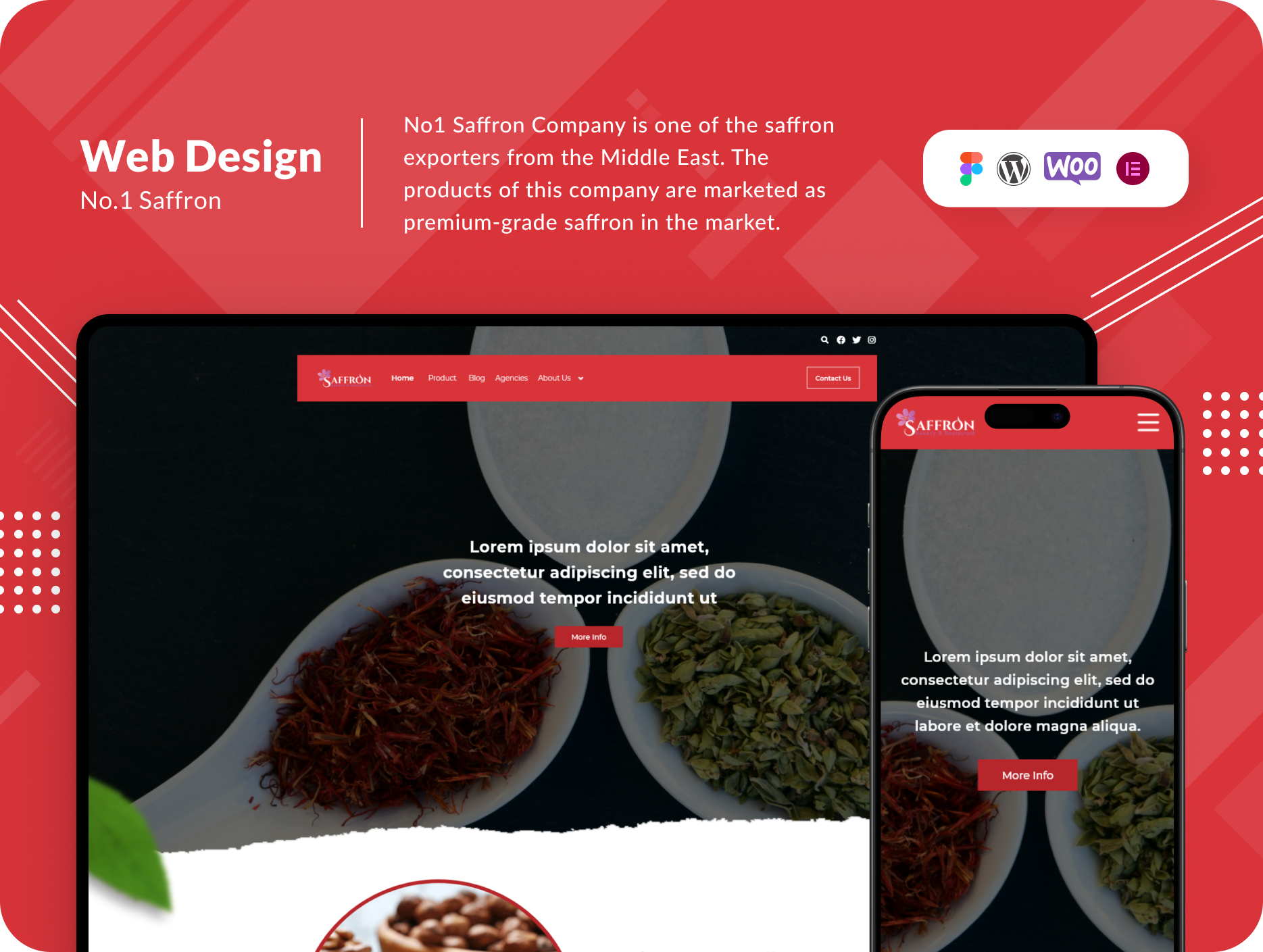
  • Brand-Driven Aesthetics: The homepage was designed with a clean and comprehensive layout, using a color palette of red, black, and white, which resonated with the brand’s identity. For landing pages, a subtle yet impactful touch of yellow and purple was introduced to captivate users and maintain brand consistency.

Results
The collaborative efforts between No1 Saffron Company and the design team bore fruit, resulting in a remarkable transformation of the website. The company’s online platform now seamlessly reflects its brand identity and effectively showcases its saffron products. The strategic page design ensures that users can effortlessly navigate through the site, fulfilling their specific needs. The infusion of yellow and purple into the landing pages has successfully captured the attention of visitors, reinforcing the brand’s identity in a visually appealing manner.

This case study serves as a testament to the power of user-centric design and the ability to breathe new life into a company’s digital presence, aligning it with evolving brand identities and customer expectations. No1 Saffron Company’s website overhaul exemplifies the successful collaboration between marketing and design, resulting in a website that truly represents the excellence of their saffron products.

StyleGuide

Desktop Landing

Mobile Landing